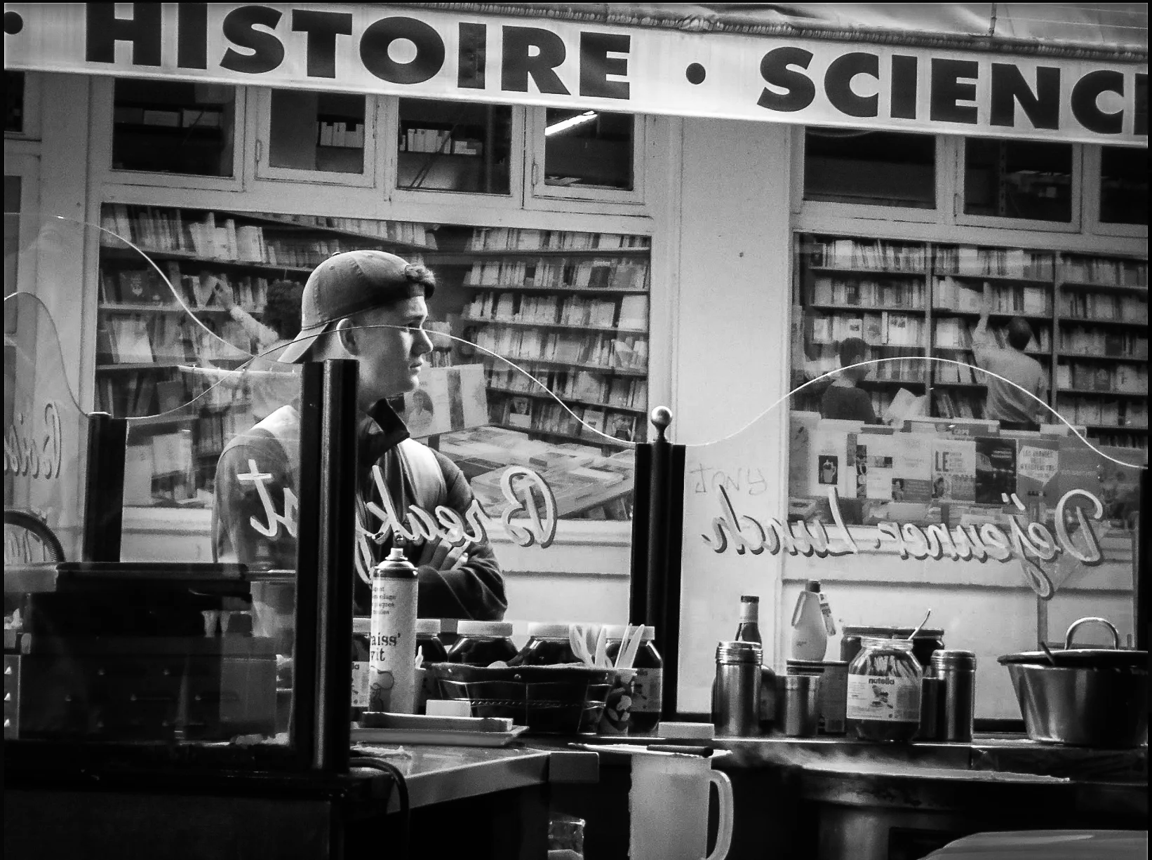
This page holds some of my favorite projects from college. I wanted to give them their own space so my professional work could stand on its own while keeping these projects live as they bring me joy & help remind me of my design journey.

This page holds some of my favorite projects from college. I wanted to give them their own space so my professional work could stand on its own while keeping these projects live as they bring me joy & help remind me of my design journey.
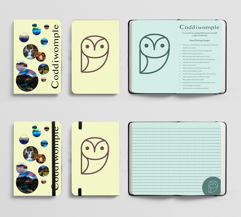
“Coddiwomple is where travel meets mental health through design. It is not a travel agency nor is it a booking agency, it is a way to deliver information to students and encourage travel. Travel is not always packing your bags for a two weeks trip to Europe; sometimes it is leaving your comfort zone for a day and going to a park in the next town over for a picnic or perhaps going on a hike in a state park. So, open your mind and Let’s Coddiwomple.”
Coddiwomple was my senior project in college, completed in May 2020, as we were not able to have a physical show due to COVID-19, I created my own website to display the project in a digital form.
I created this project to link mental health and travel, as I found myself through my travels. I wanted others to be able to feel this way and to figure out what they want in life early on and to travel while they are young and before life gets in the way.
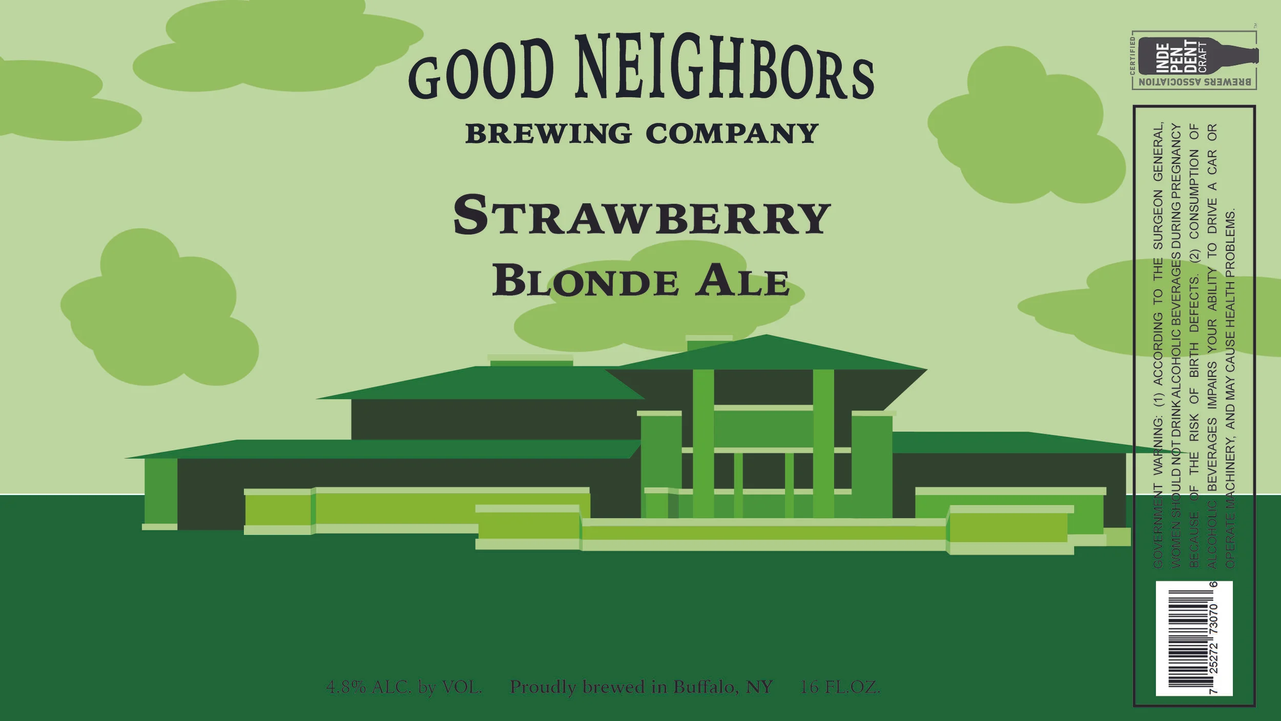
I created these labels in the fall semester of my senior year for my senior graphic design class. We worked with Flying Bison Brewery and were tasked with creating 3 beer labels (I ended up making 4, one for each season). I chose to base my beer around things I associated with Buffalo, and paired them with some of the strong architecture present in the city. I created the beer brand Good Neighbors Brewing Company, based on one of the many nicknames given to Buffalo.
For my fall beer, I chose an apple beer and paired it with City Hall. I know a lot of places part-take in apple picking, but for my family and I, apple picking is a staple of the fall season.
For my winter beer, I chose to go with a maple beer and pair it with the Albright Knox. My absolute favorite part about winter is Maple Weekend; venturing out to sugar shacks and trying anything and everything that they infused or coated with maple.
For my spring beer, I chose to go with a loganberry beer and pair it with the Botanical Gardens. Loganberry is one of my favorite drinks and is a flavor that I associate with every season but I thought it paired the best with spring. This is one of the only labels whose architecture had a correlation to the beer itself, with it being a spring beer it was fitting to include the gardens, which have blooming flowers year round but flowers are associated with spring.
For my summer beer, I chose to go with a strawberry beer and pair it with the Frank Llyod Wright House. In my family, in the summer there is nothing better than fresh strawberries, strawberry shortcake, and strawberry drinks.
I loved working on this project and the creative freedom that it allowed. I used Adobe Illustrator to create the mainly monochromatic illustrations and then used Adobe InDesign to create the layout and add in the typography. I also used Adobe Dimension to create the digital mockup (first image).
For my advanced typography class we had to create a magazine that included a cover, a table of contents and a 2-page spread. I immediately thought of doing a magazine about travel, targeting young people and including stories from young people about their study abroad and travel experiences. I wanted to use strong imagery to go well with the strong typography. I loved working on the spreads and the layout of each page.
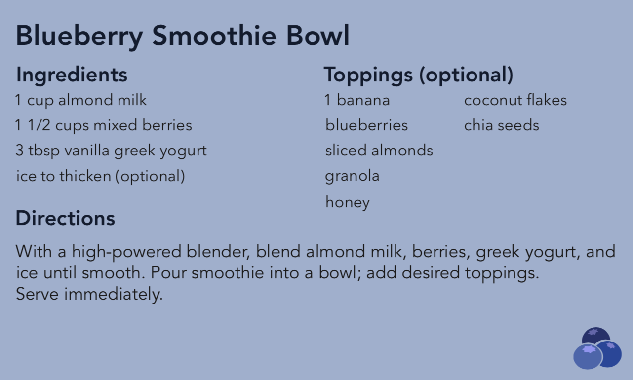
For my advertising class we were assigned to create a marketing campaign for any fruit or vegetable. I chose the blueberry as it is my favorite fruit and there are so many health benefits associated with them, they are a super food. So I chose to create social media posts with some of the photos I took for this project. I took over 200 photos and had a lot of fun staging and photographing all of the food that I created — and my family loved eating all of the food. I also created recipe cards with the images I used as well as easy to follow instructions on the back.
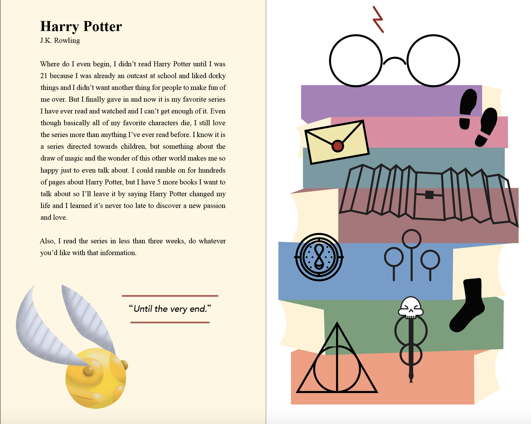
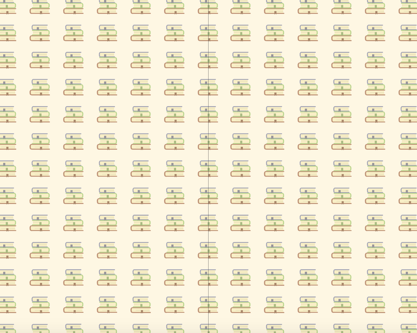
I created this project in my senior graphic design class in the fall of my senior year. We were tasked with creating a Zine about a topic that we enjoyed or felt passionate about. So I chose to create a “Book of Books” which was a short guide to my favorite books and why I love them. I am a mildly awkward person and when someone asks me for book recommendations or asks what my favorite book is, I completely forget every book I’ve ever read. So this is a guide to all of my favorite books.
I created over 50 icons in Adobe Illustrator, along with 6 more illustrative pieces to go along with each book, made in Illustrator and Photoshop. I used Adobe InDesign to do the layout and add the typography.
I loved how much creative freedom I was able to have with this project and I had a lot of fun creating this Zine.
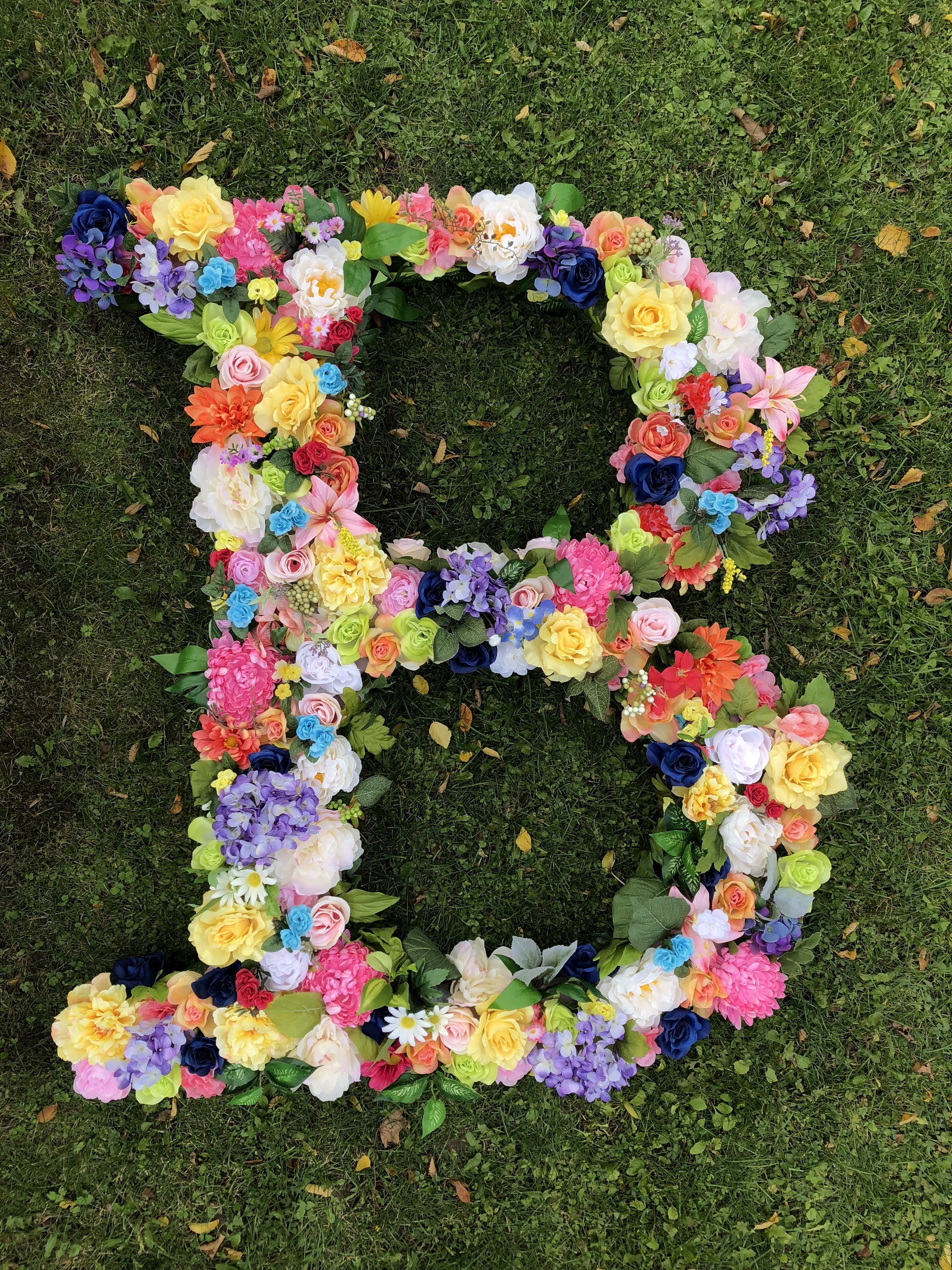
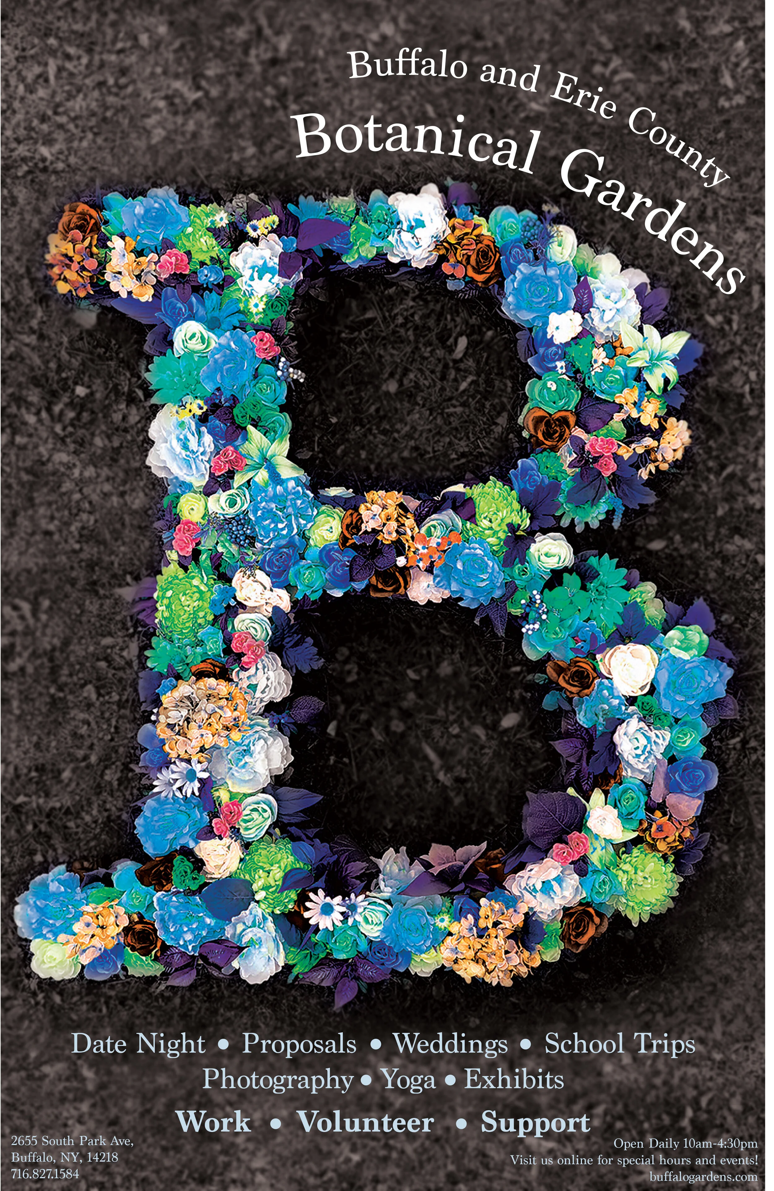
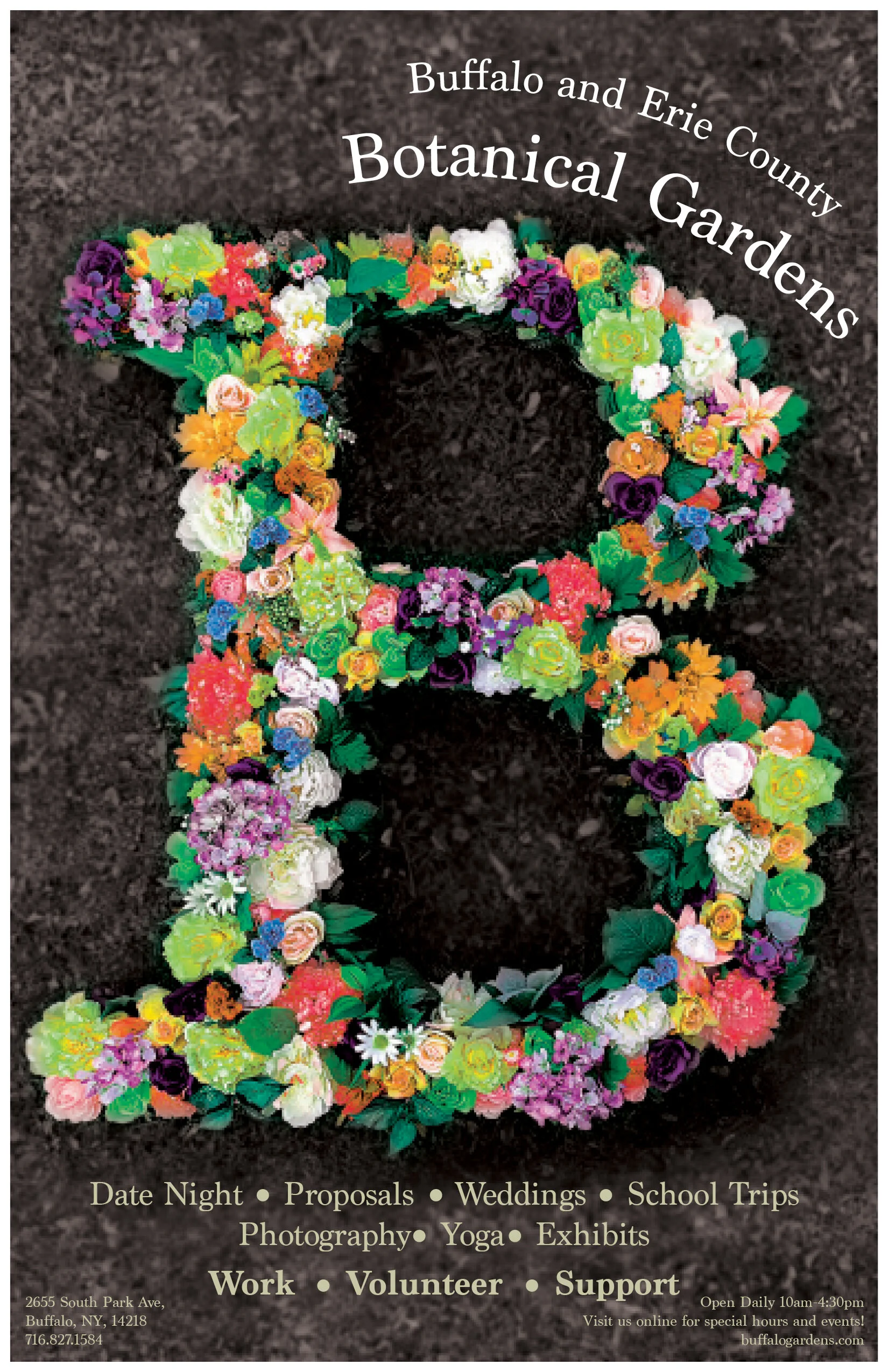
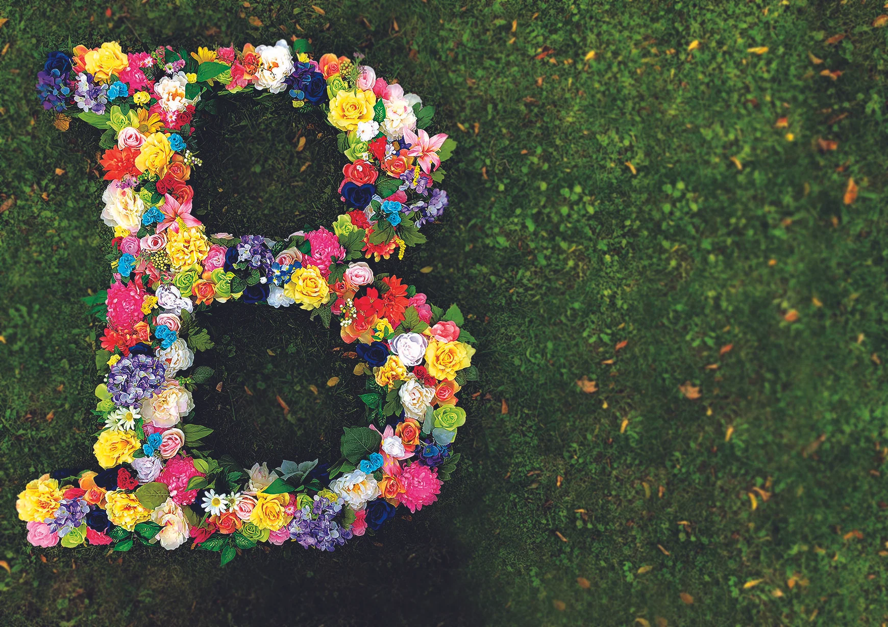
For my advanced typography class we had to create a 3-D letter that was a minimum of 3 feet tall. I chose to create a 4 foot B using the typeface Marion. I carved it out of polystyrene and then bought a ton of flowers from the craft store and cut them off of their bushes and stuck them into the letter. I enjoyed seeing how the different types of flowers and their colors related to each other. The letter was 4 inches thick and I lined the sides with the leaves I had left over. Once that part of the project was over, we were then tasked to implement our letters into an ad. I chose to use my letter to advertise for the Botanical Gardens, I created four different posters, showcasing different colors, one for each season, showing there is something to do their year round, not just in the spring or summer.
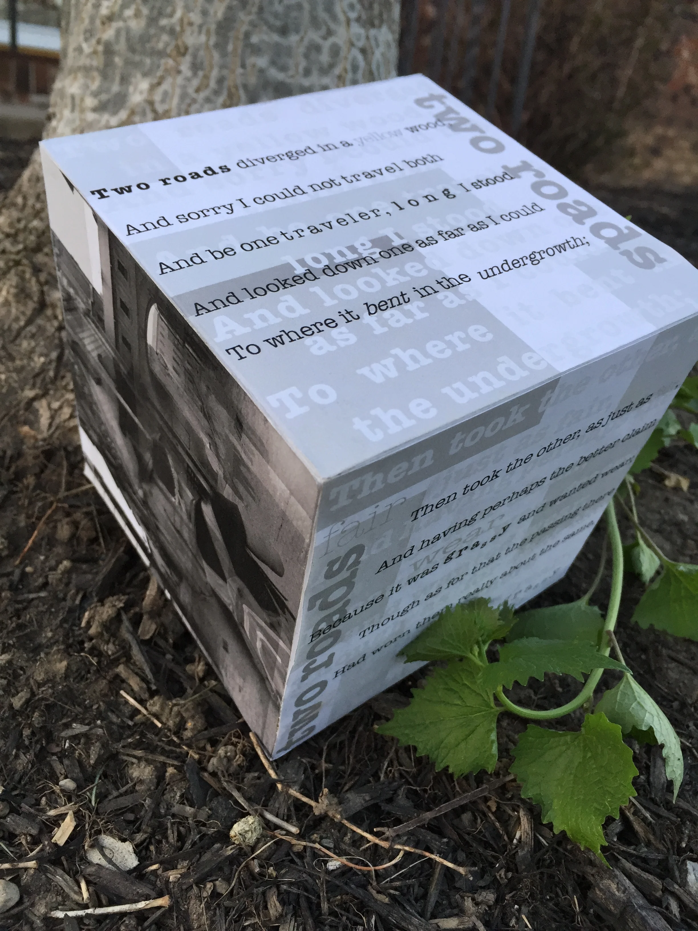
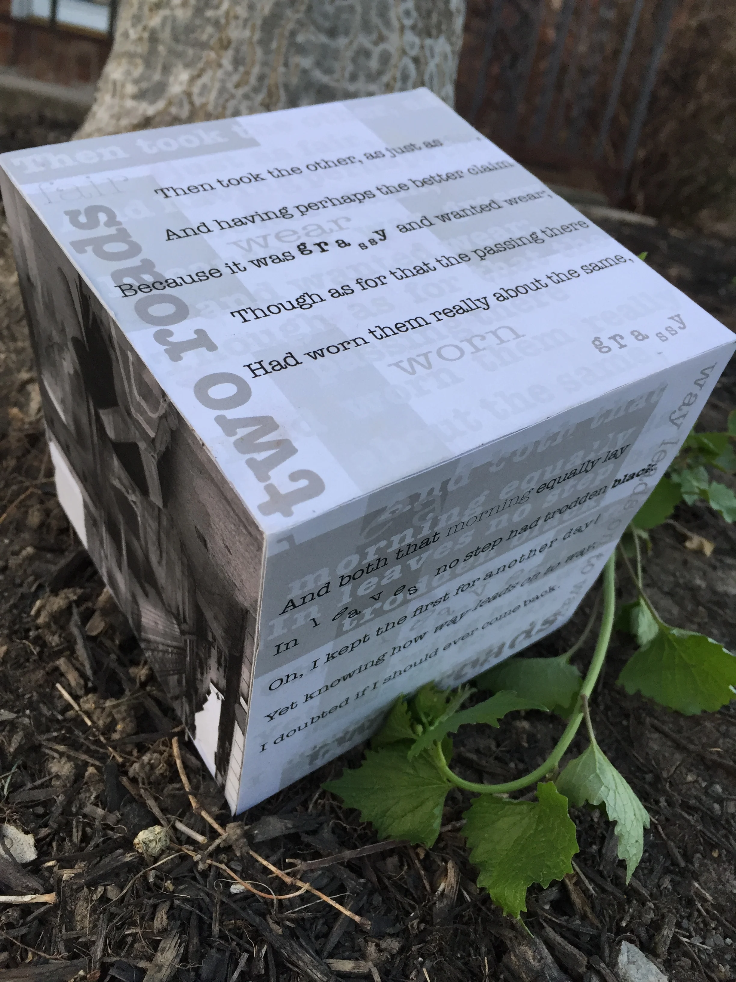
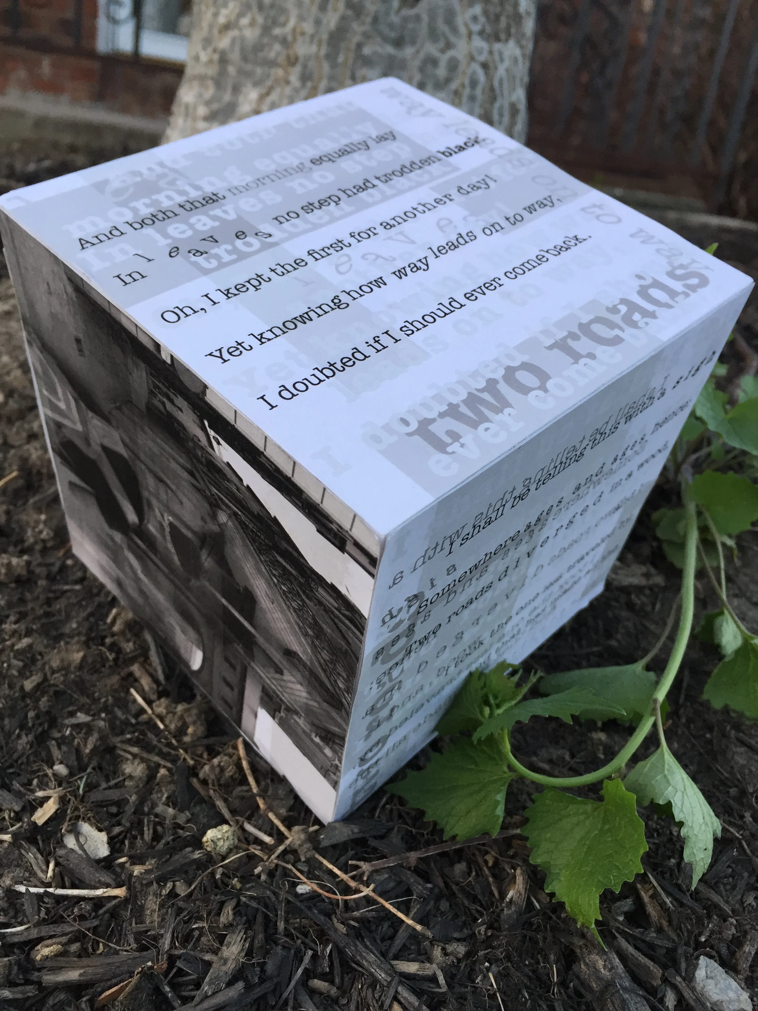
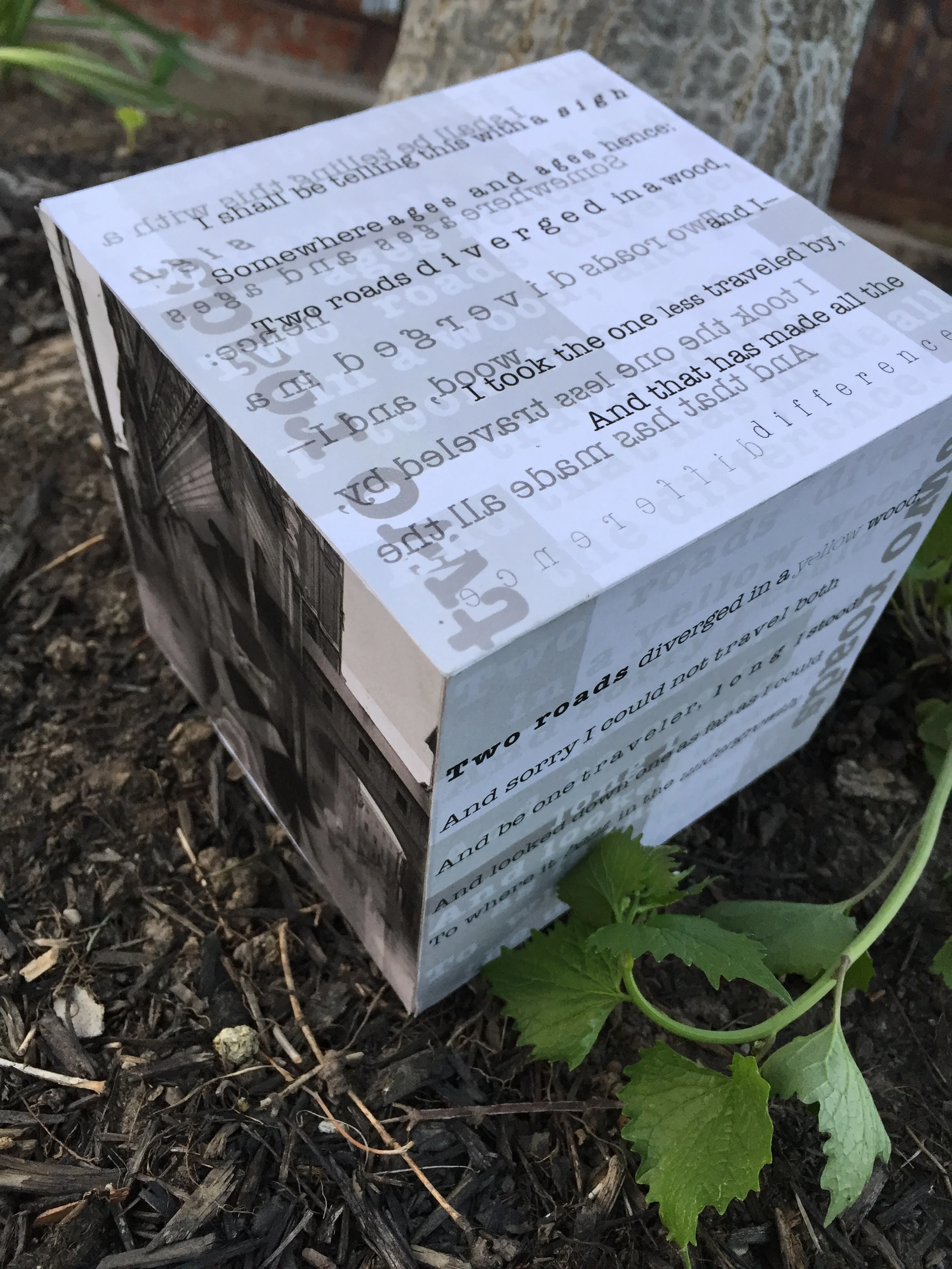
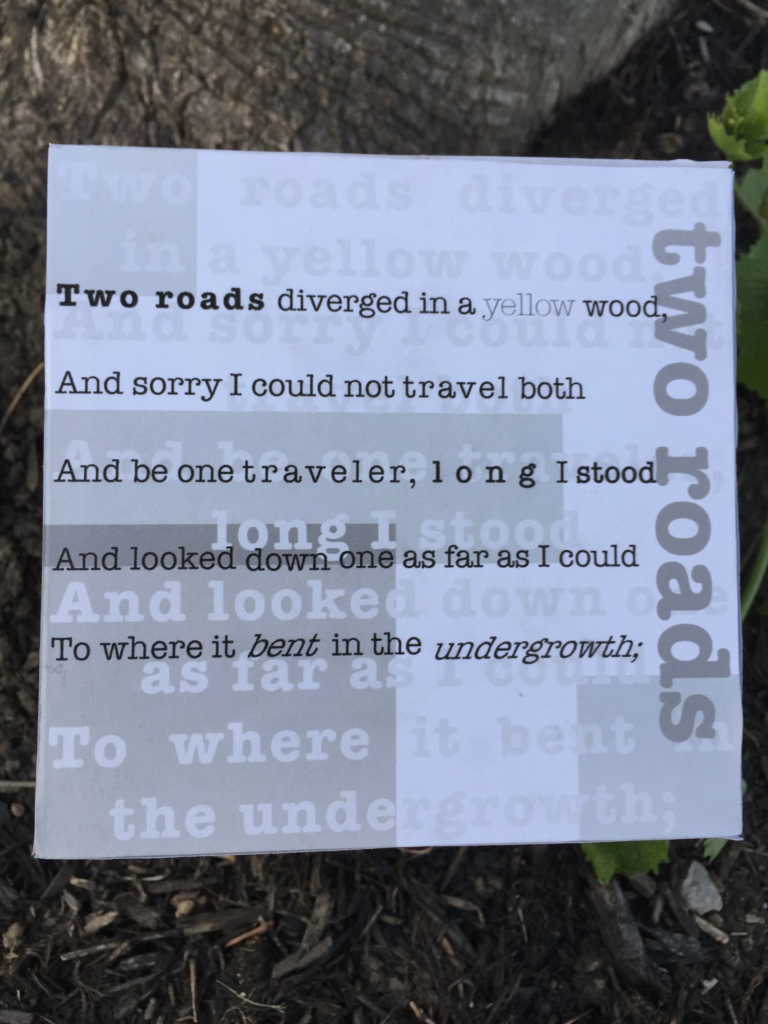
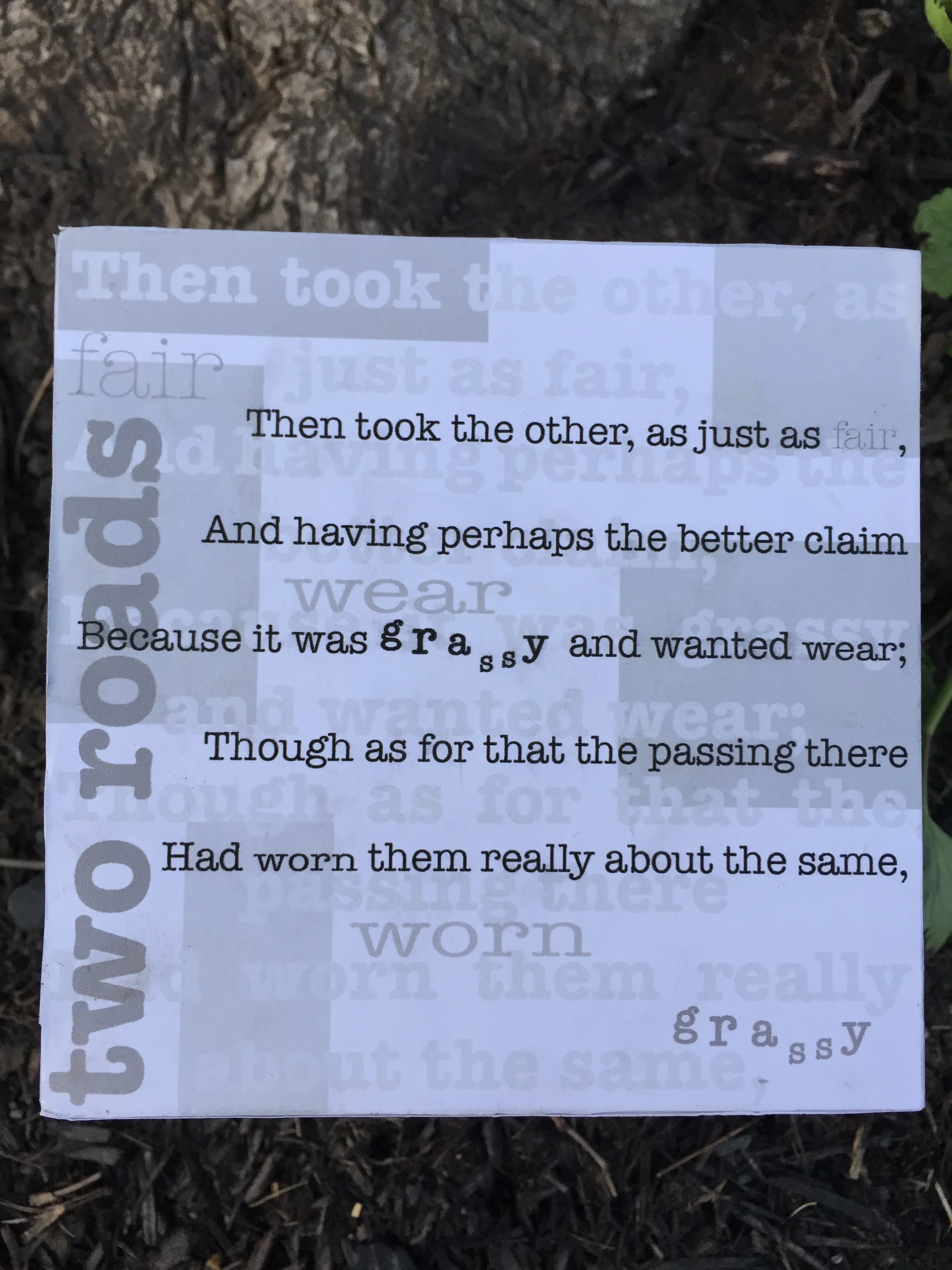
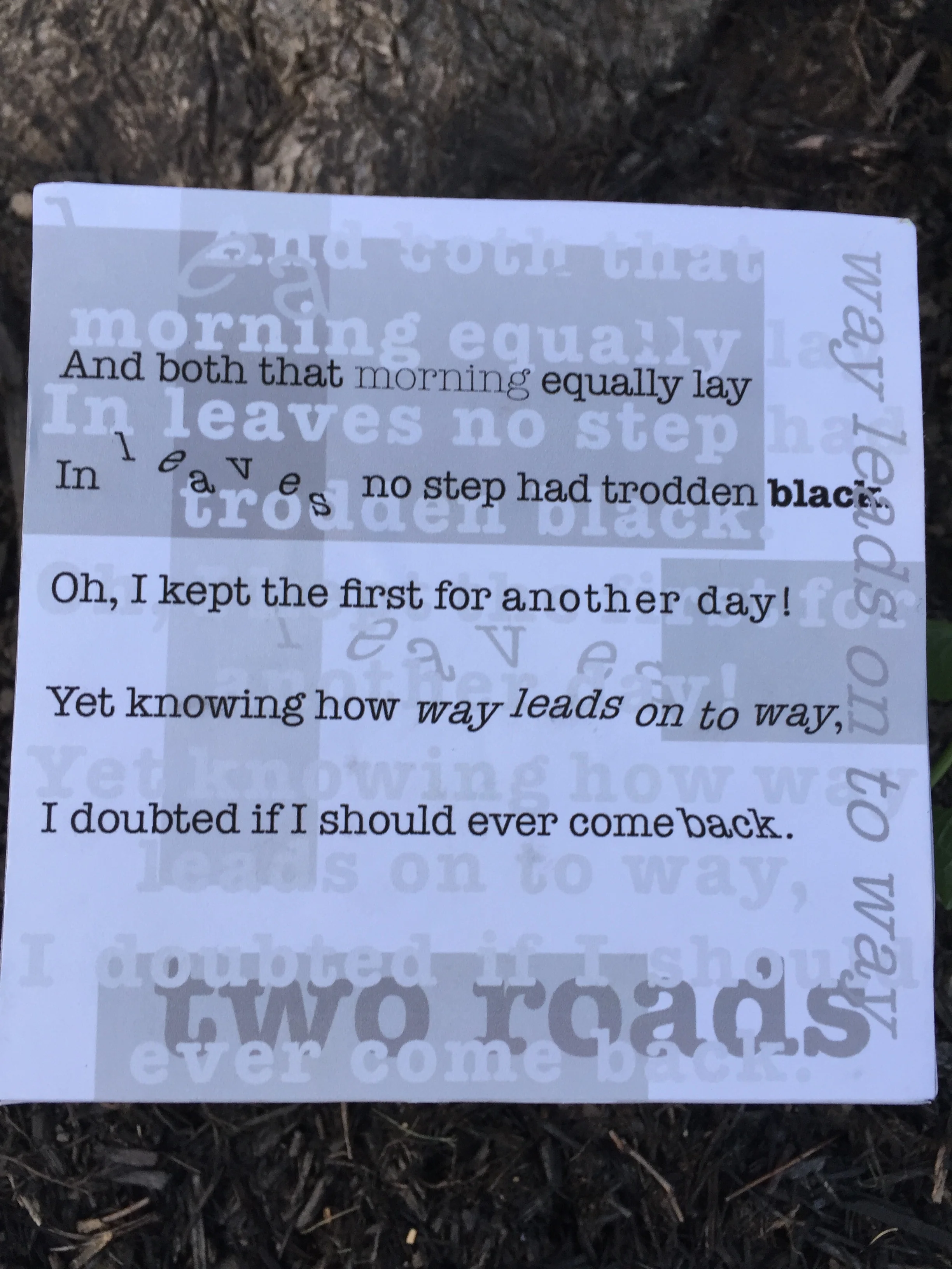
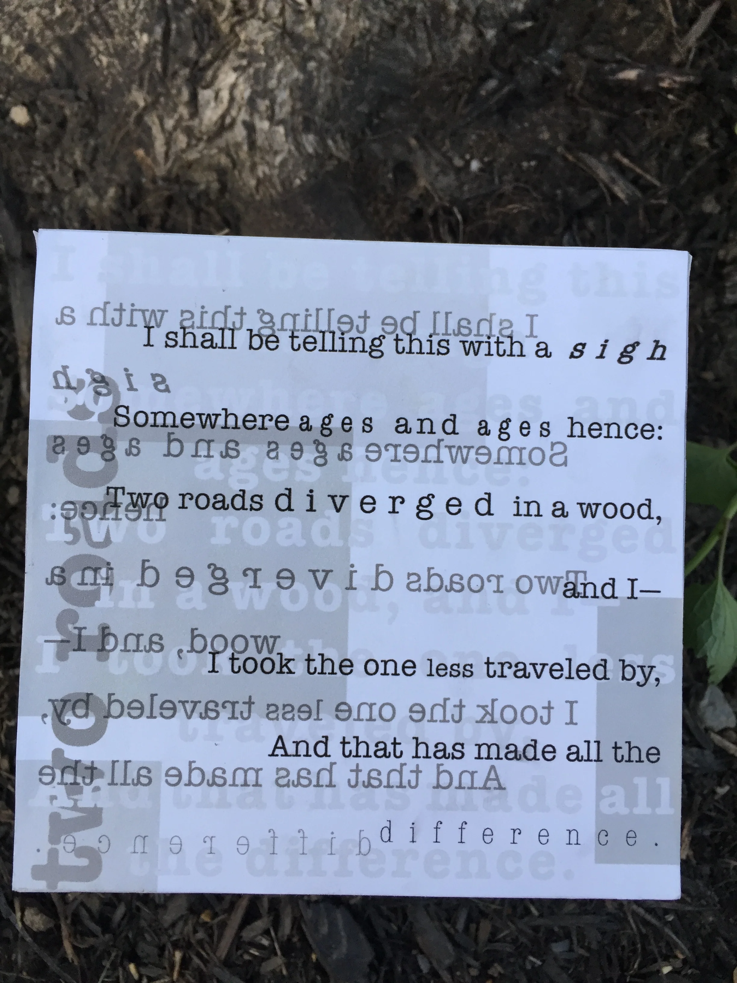
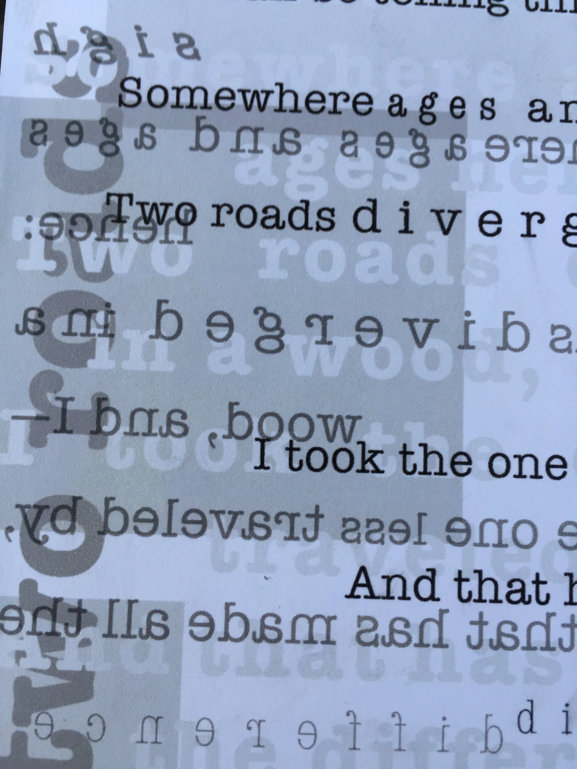
For my typography class final, we had to create a 6x6 inch foam cube that had typography on it — it could be a song, speech, novel excerpt or poem. I chose the poem “The Road Not Taken” by Robert Frost, it is a poem that I memorized for my AP English class in high school and I know it to this day. I wanted the faces of the cube to get more and more chaotic as the poem went on, ending with the last stanza being the hardest to read. I also had the transparent blocks fold over the edges to bring all of the sides together. Perfectly, there were four stanzas in this poem, and with the two extra sides I created photo collages of people standing at a cross roads, one being actual roads and another being forests — thankfully I take a lot of photos where my friends walk in front of my pictures so I had a good amount to choose from. This was my favorite project from that semester because I really experimented with how far you can push typography and how the different setting impact the word itself.
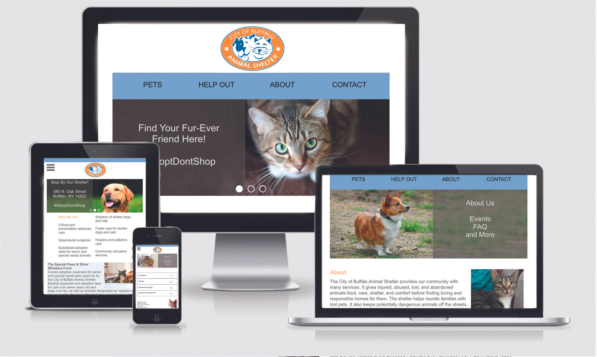
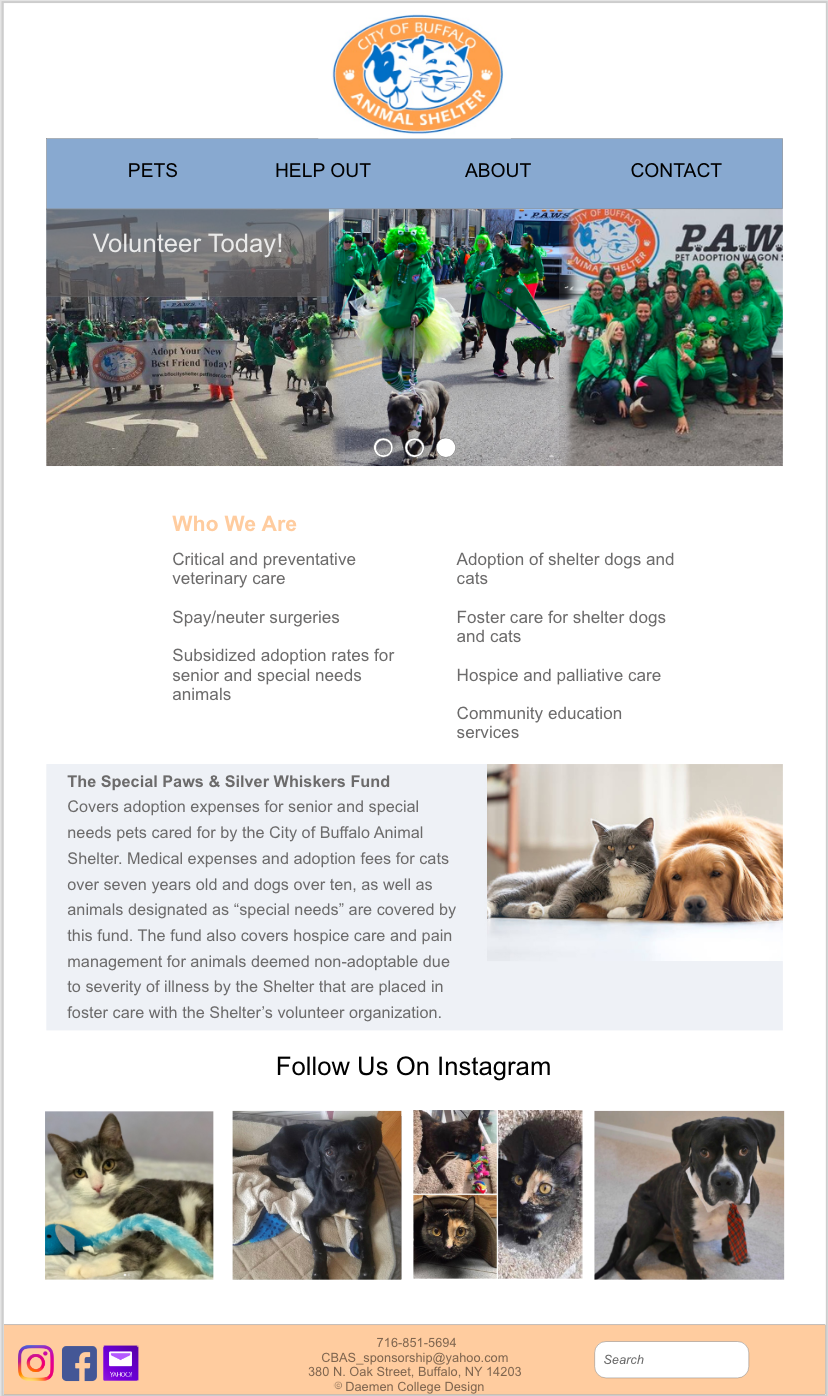
This project was for my web design class, where we had to pick a website and redo it from a UX and UI standpoint. I chose the Friends of the City of Buffalo Animal Shelter. I simplified the navigation, the color palette, and reorganized the site and it’s links. I did not make every subpage, because the assignment called for a home page and two subpages. I chose to redo this website because I love the work that the shelter does and I think their marketing and advertising would be stronger if they had a better website, so when people went to the site it would be easier to navigate so people will be more likely to adopt, donate, or learn more about.
Program: Adobe XD and Photoshop
I began my personal branding exercise shortly before I went to my first craft show to sell some of my paintings. I wanted to pick a symbol that meant something to me, but that could also be simplified into a basic logo. So, I ended up picking a hummingbird and simplifying it, but still having it be distinguishable from other birds. To me the hummingbird represents my grandparents who have both passed; the hummingbird is a symbol of fleeting time, and the enjoyment and appreciation of each moment in life, however short it may be. My color palette that I chose is basic, and for a very basic reason - blue is my favorite color, but I didn't want anything too bright or overwhelming. I chose the quote on the back because my grandpa gave me a sweater with that quote on it for Christmas the year before he passed, and since then it not only relates to art for me, but also as the last thing he gave me.
I have recently updated my business card, the new design is at the top (the vertical cards). I decided to leave my old design up as well to show the progression, I also still like the design of the card for what it was.
Programs: Adobe Illustrator & Adobe InDesign
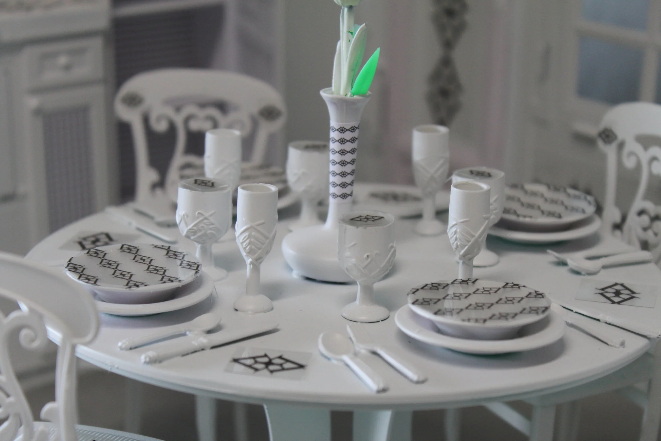
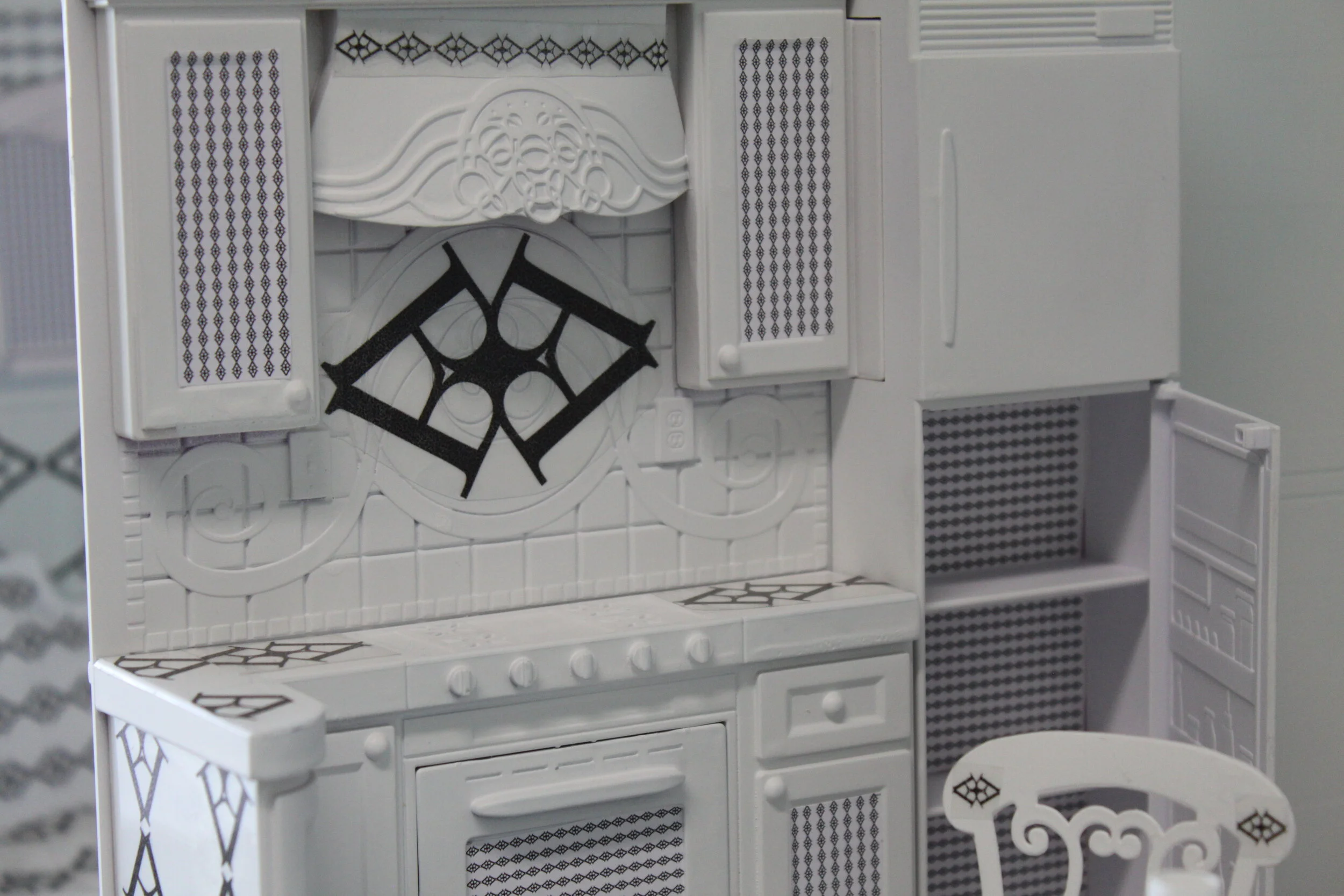
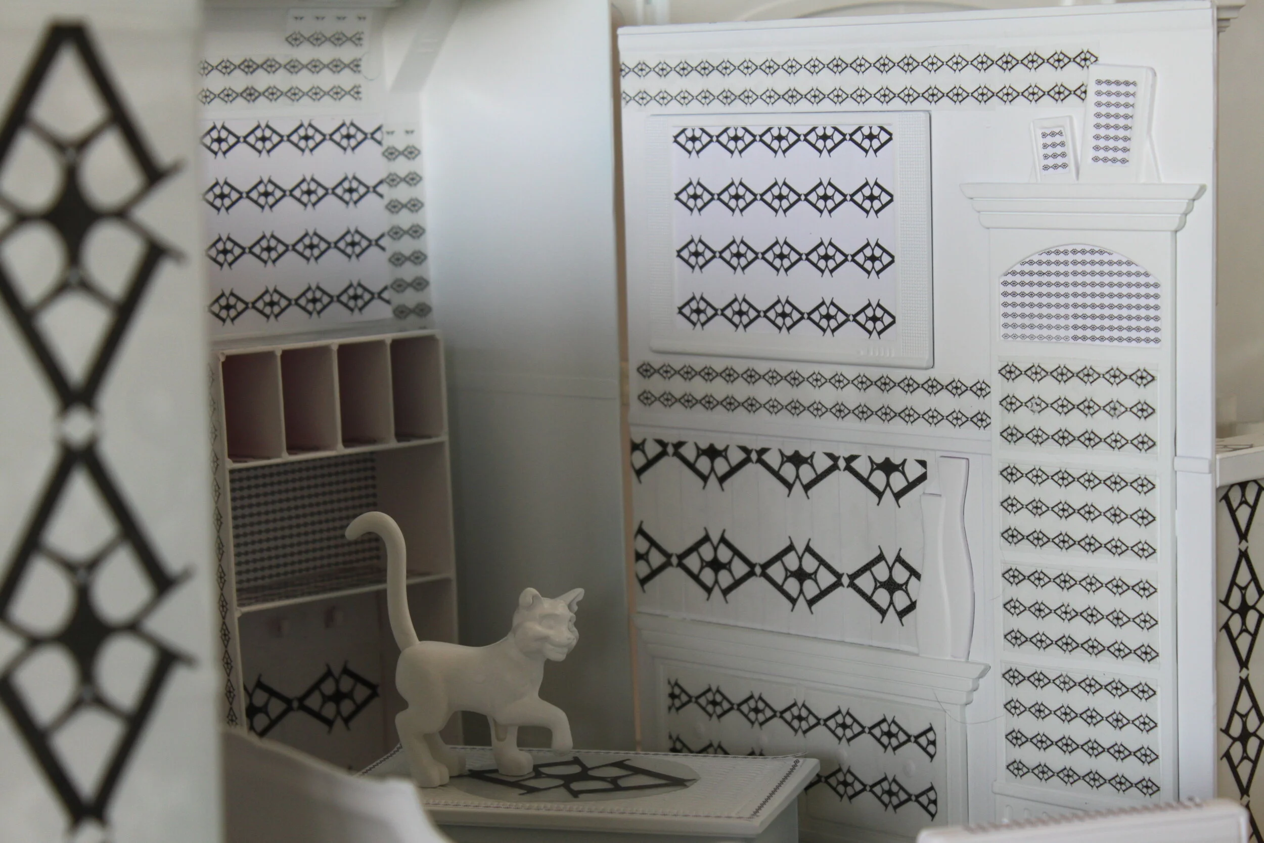
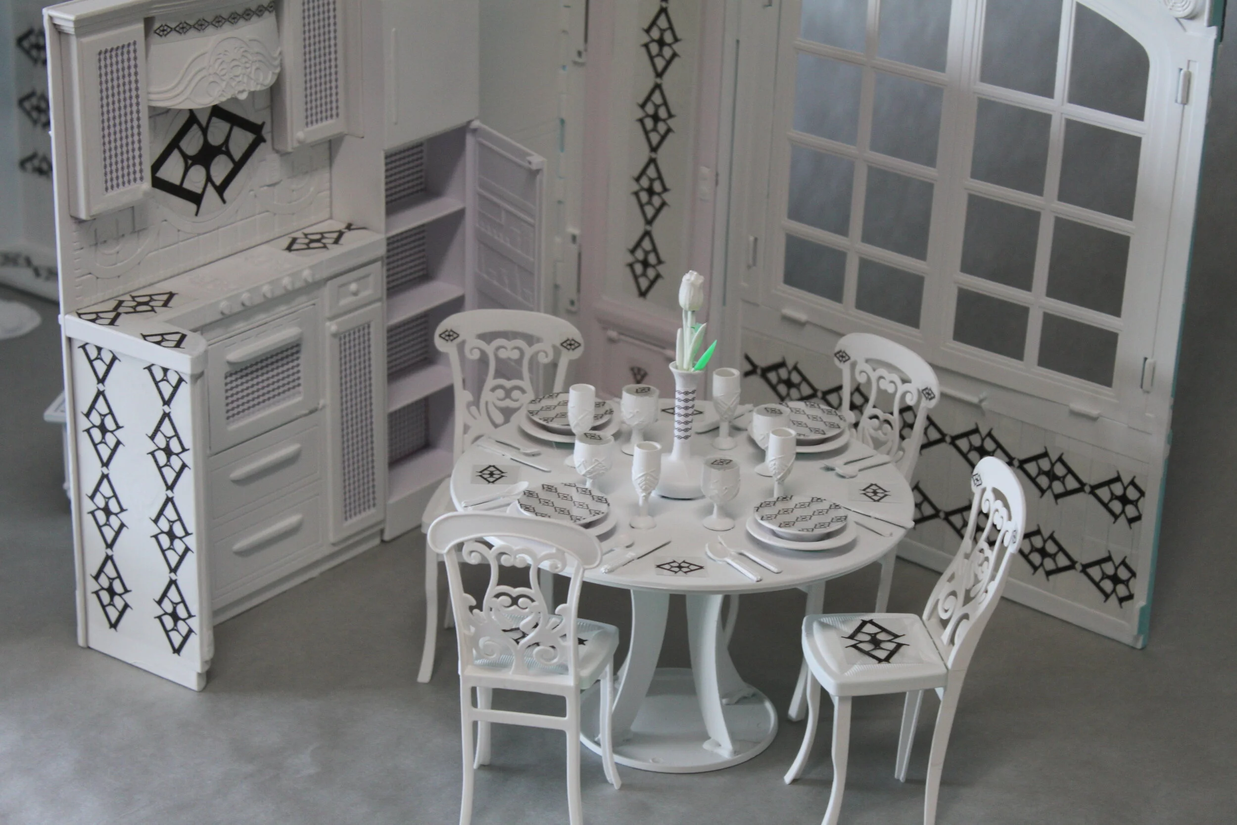
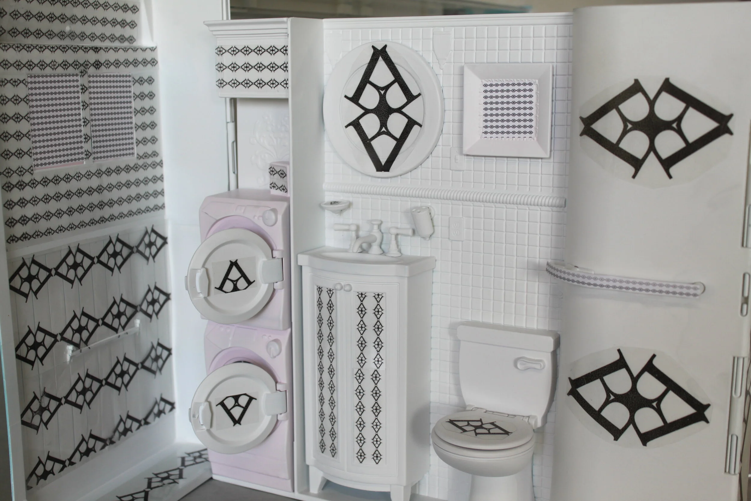
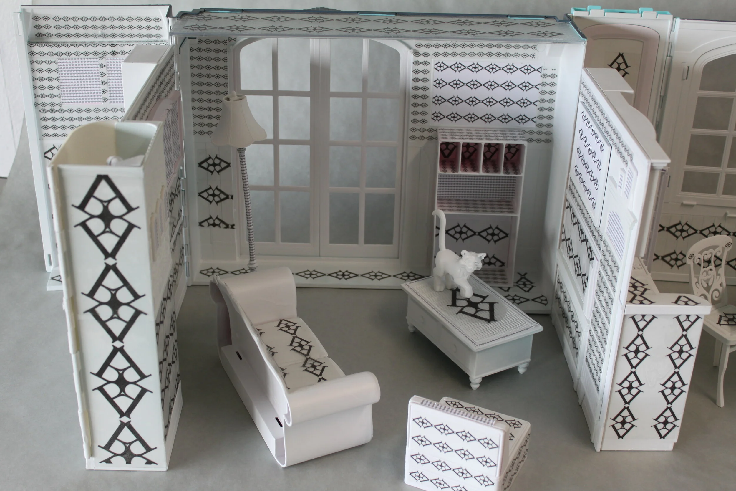
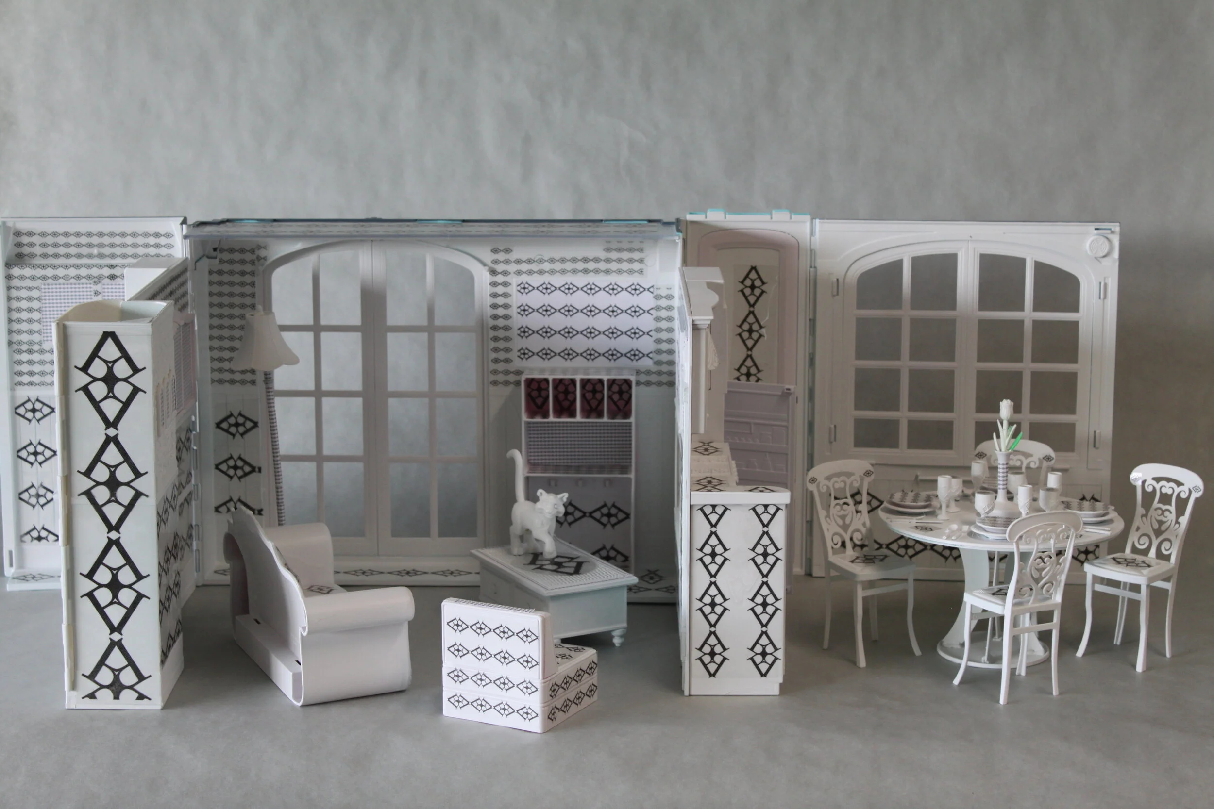
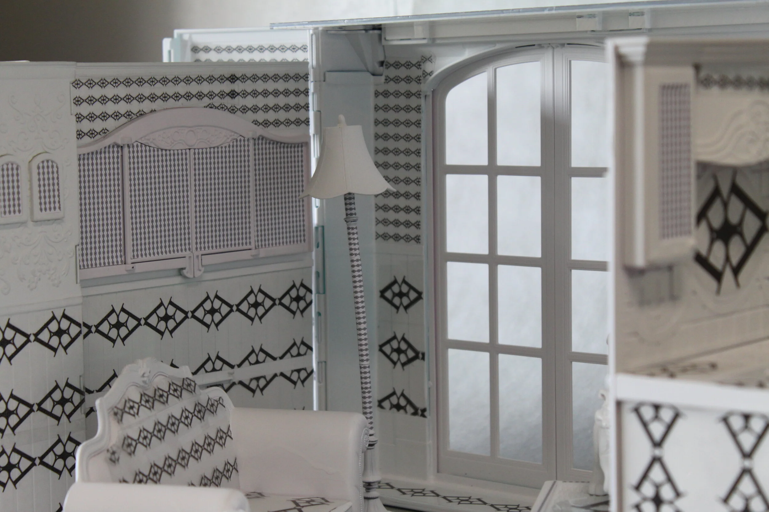
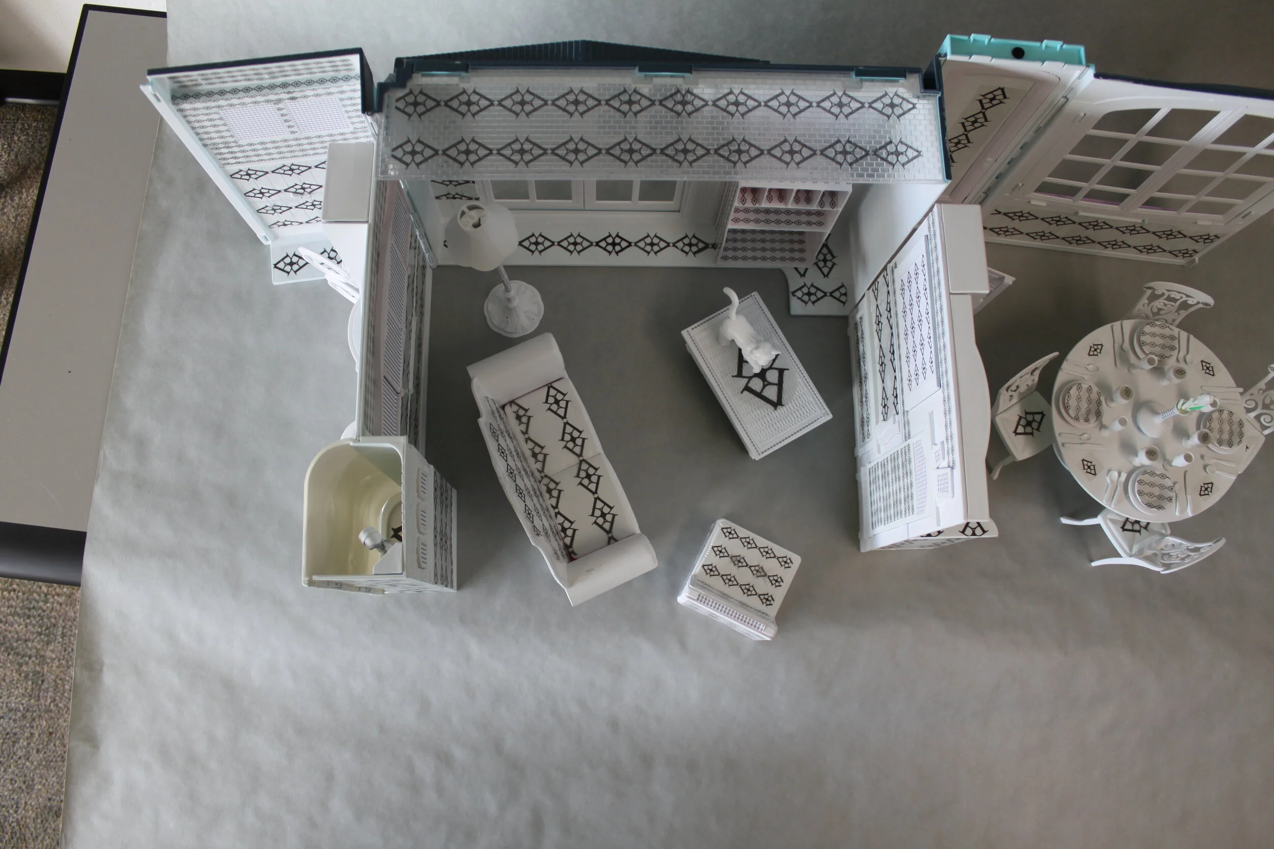
I created this project my sophomore year of college. We were tasked with creating a pattern from a single letterform. I chose a B, obviously. After creating a pattern, we had to apply it to an object. I couldn’t decide what exactly to apply it to and had a huge list of things I could use, so I decided to put them all to use and apply it to a house. I took an old Barbie house I had in my basement and spray painted it white. I printed my pattern out onto self-adhesive vinyl and spent many pain-staking hours applying it to the house.
This was a project for my typography class, in which we had to use a grid to create a calendar, while not using any actual lines, like one would expect in a calendar. We had to include the number date, day of the week, month, year, and day of the year in each “square”. I chose such a big font to create a sort of chaos in the piece, while containing the dates to their own space. It gets naturally more chaotic as the month goes on due to the double-digit numbers; but I enjoy the feel of it, sort of as a metaphor that months seem busier as they go on. I didn’t want to separate any dates for the rest, except for two of them. The first being Friday the 13th, I made all the text in that date very scared, and some are “hiding”, the feeling of timid or scared, as it is an unlucky day. Then other day I wanted to callout was the 23rd - my birthday - I made all the text bigger, and filled the whole box.
Program: Adobe InDesign
Font: Impact
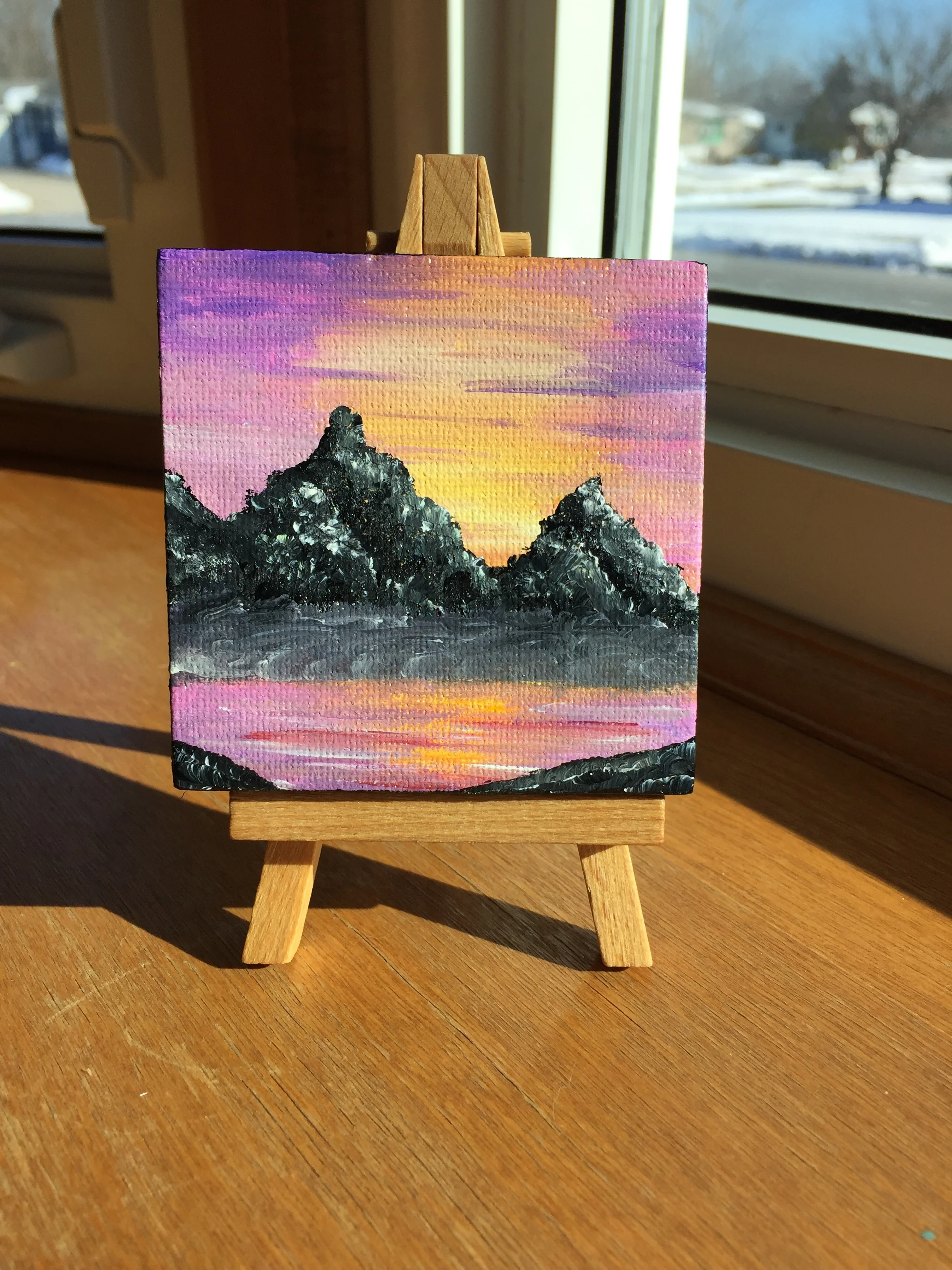
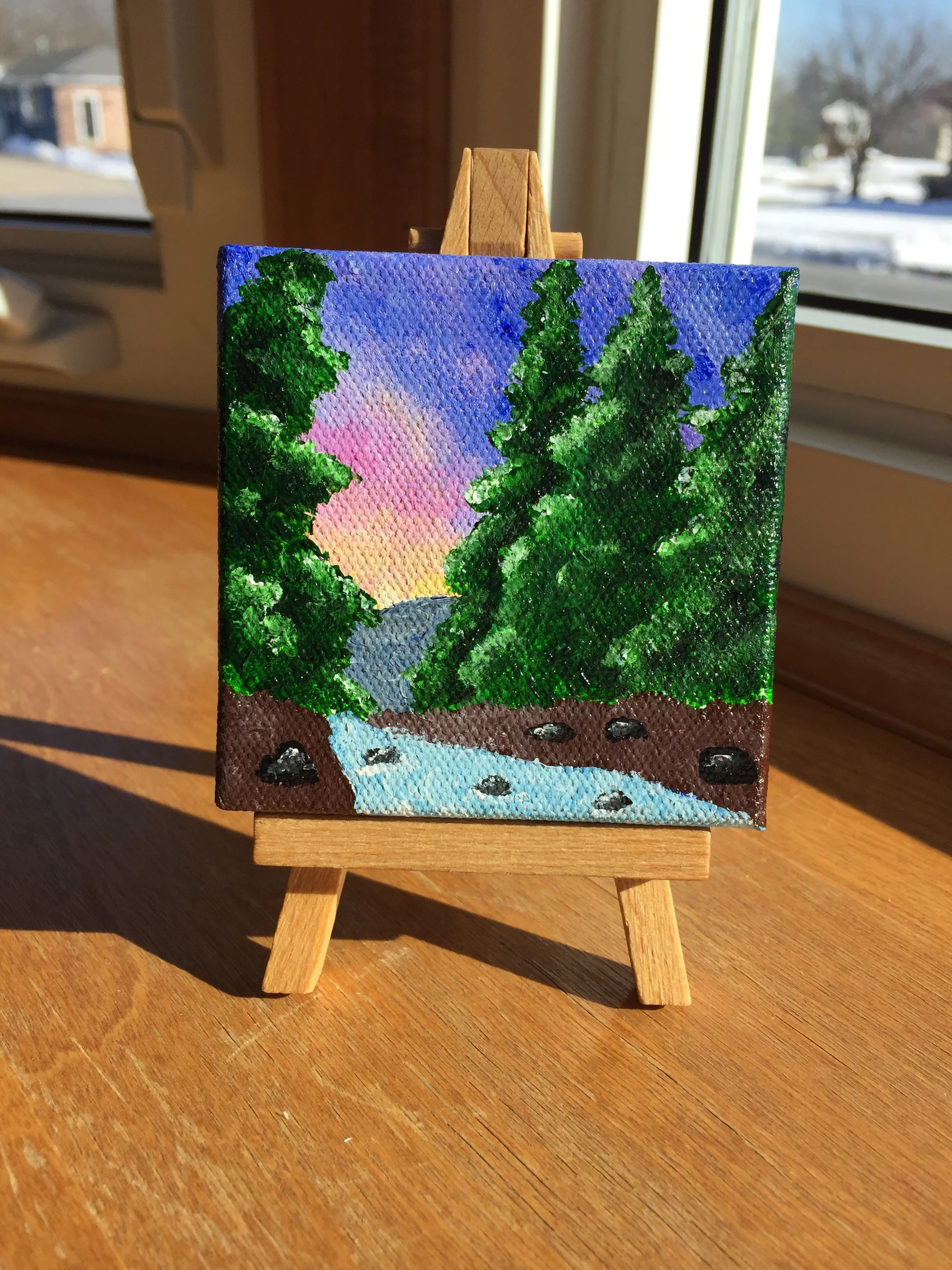
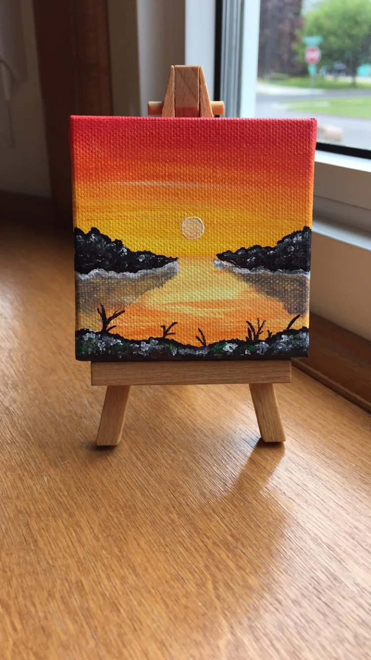
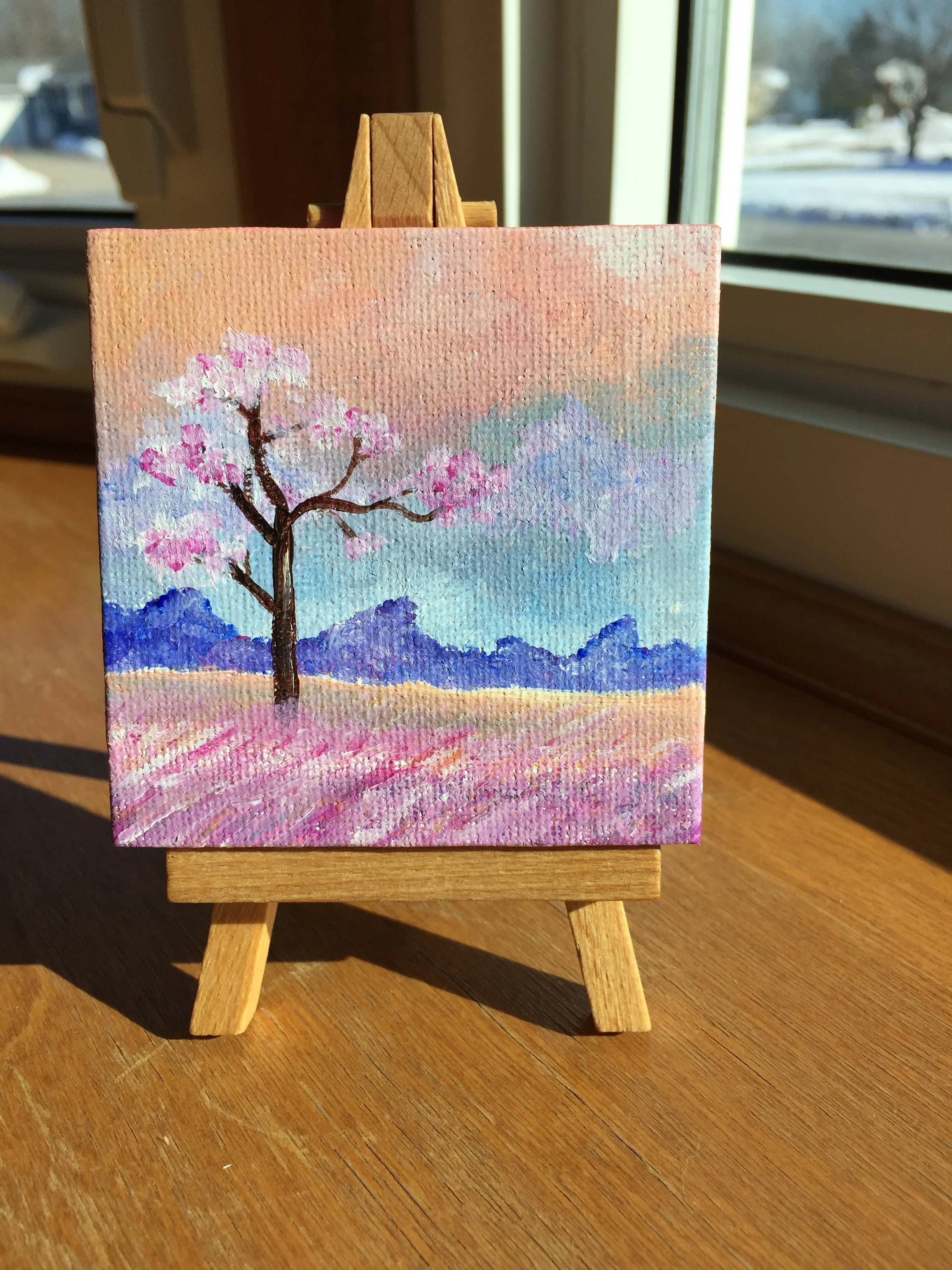
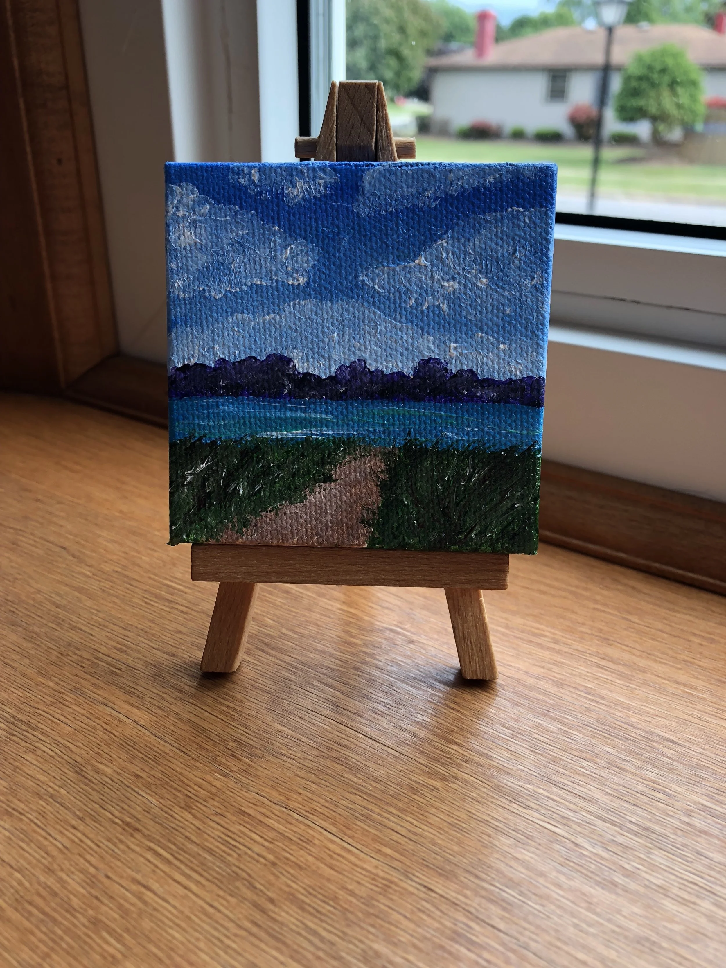
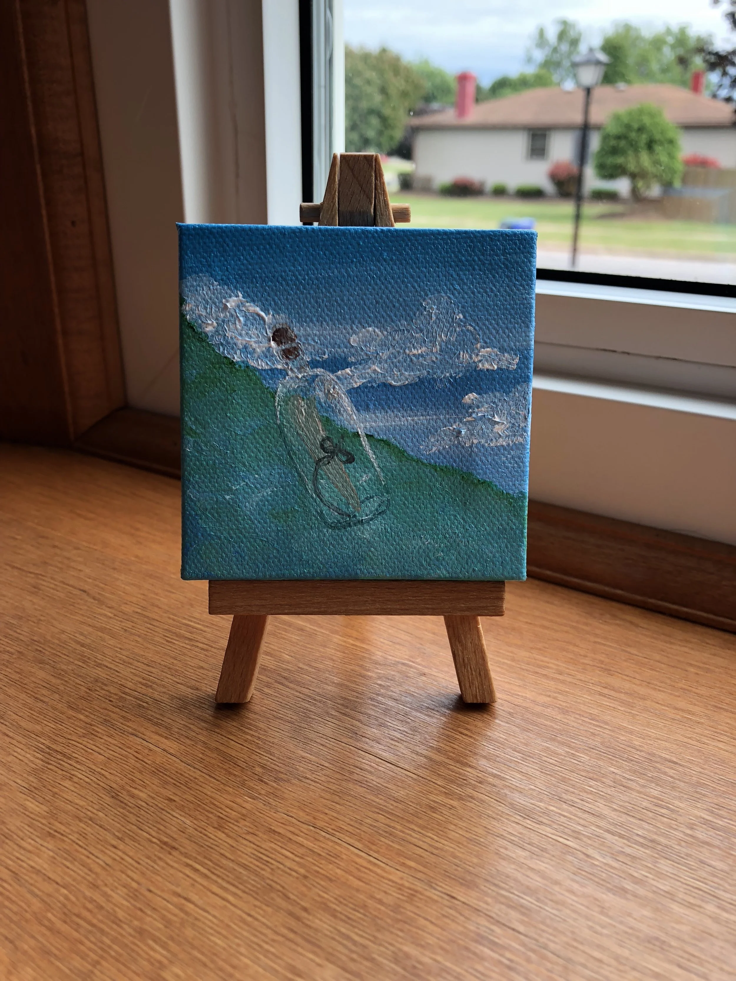
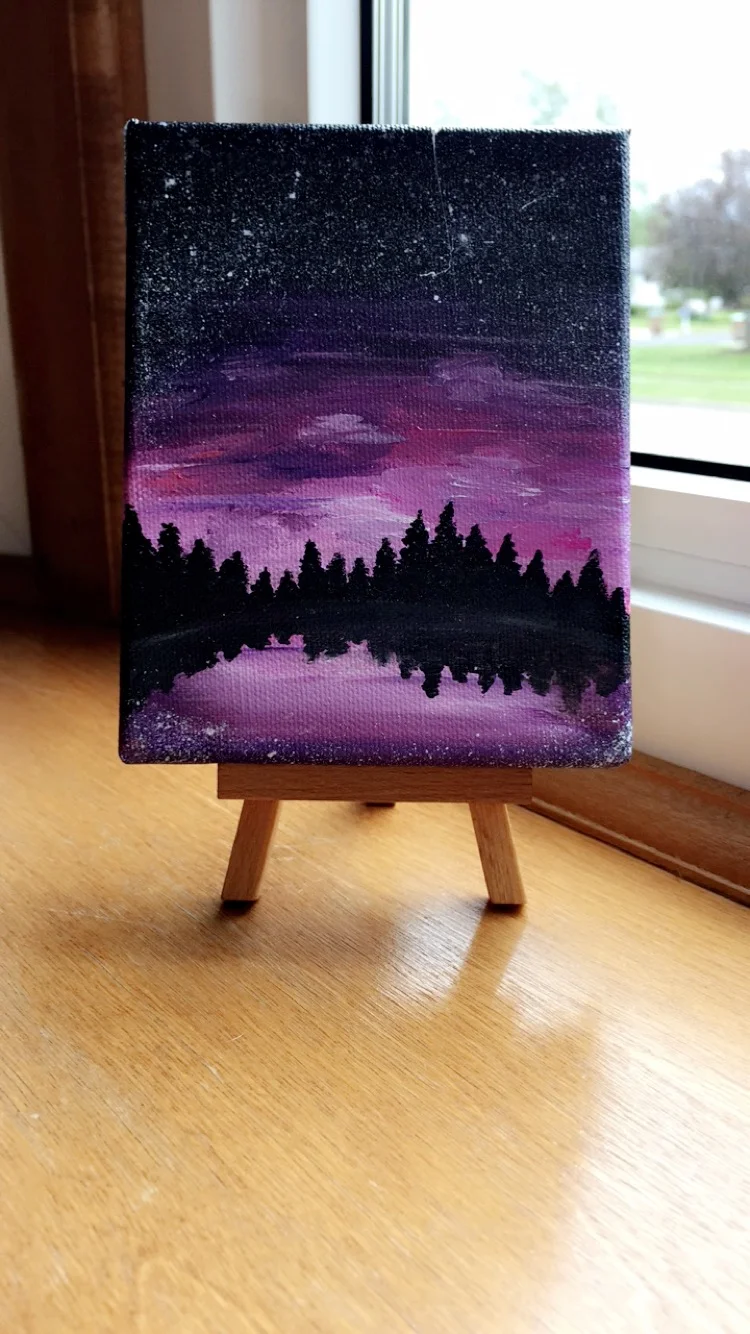
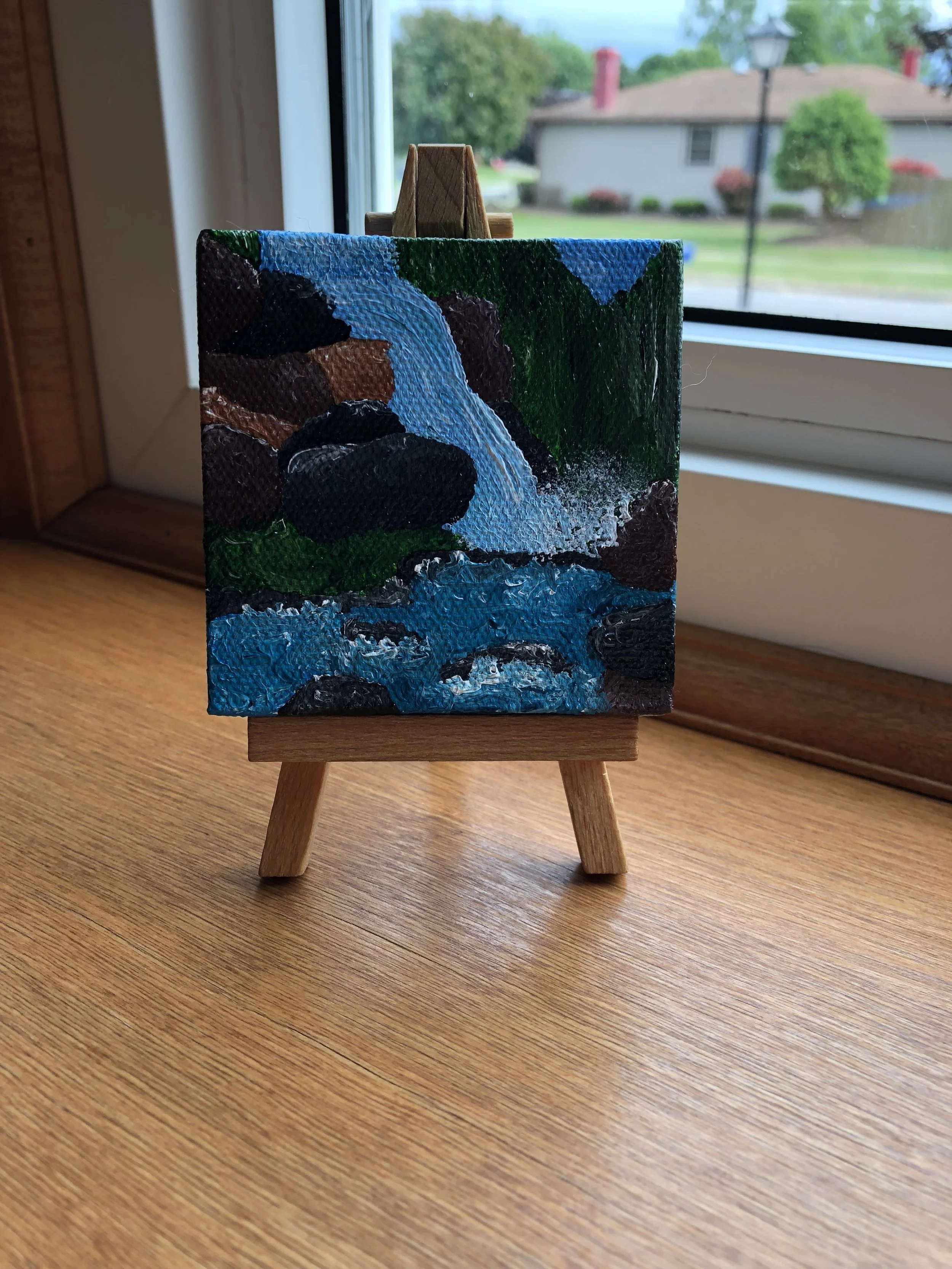
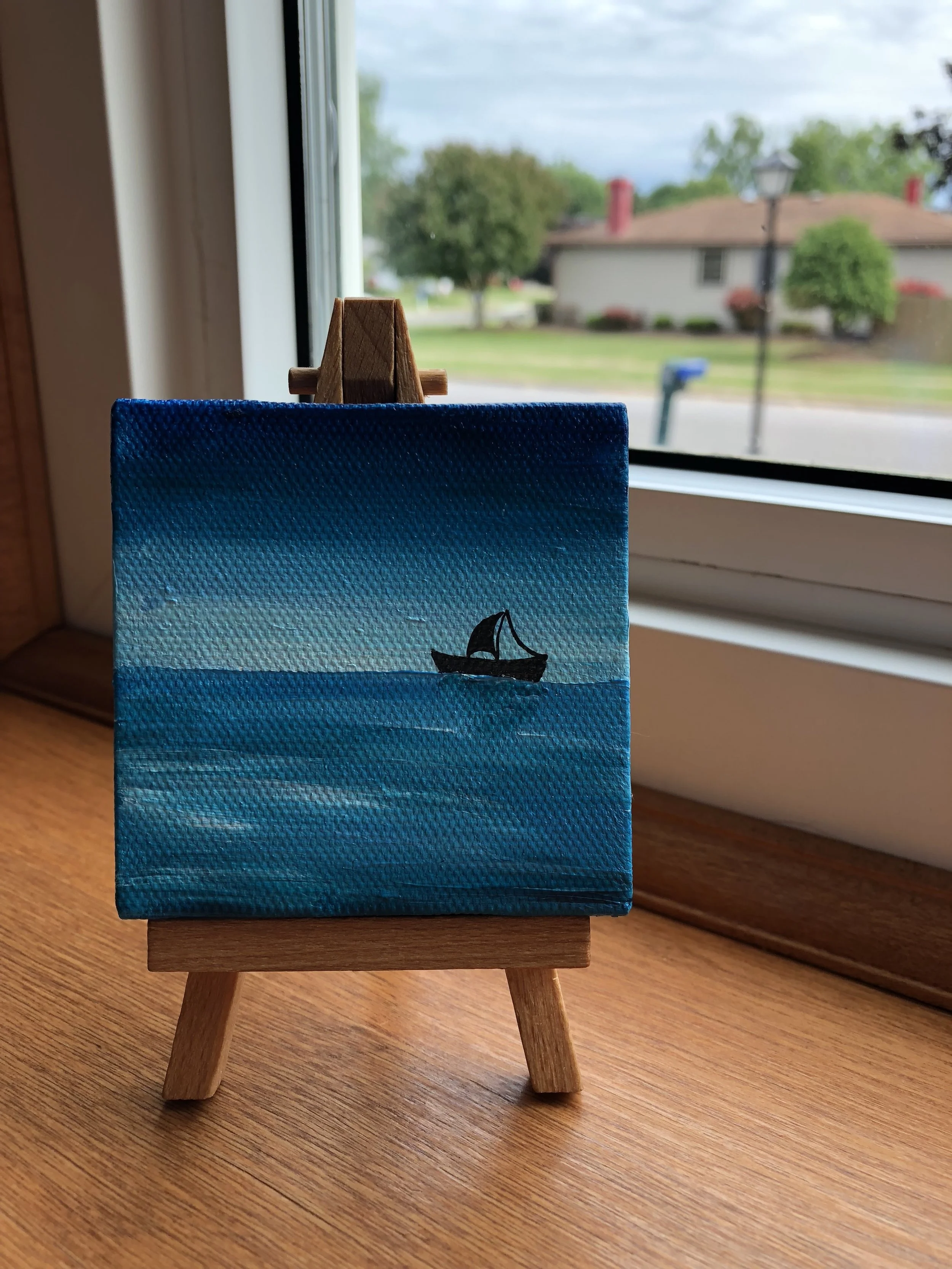
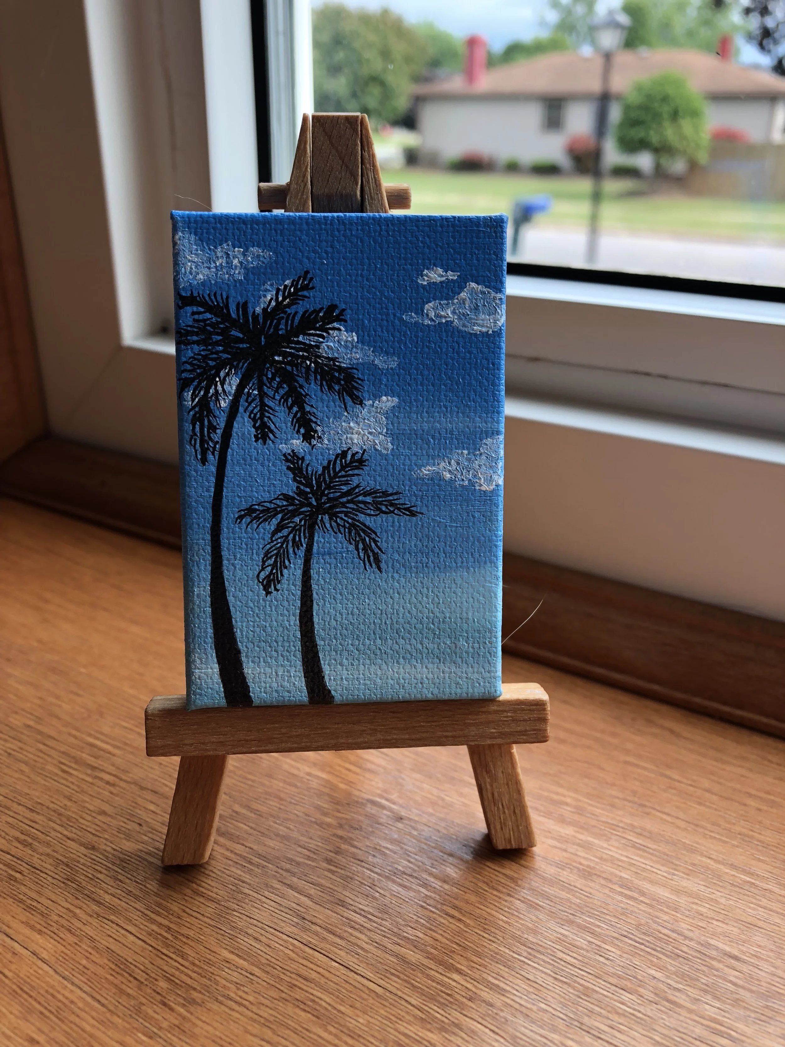
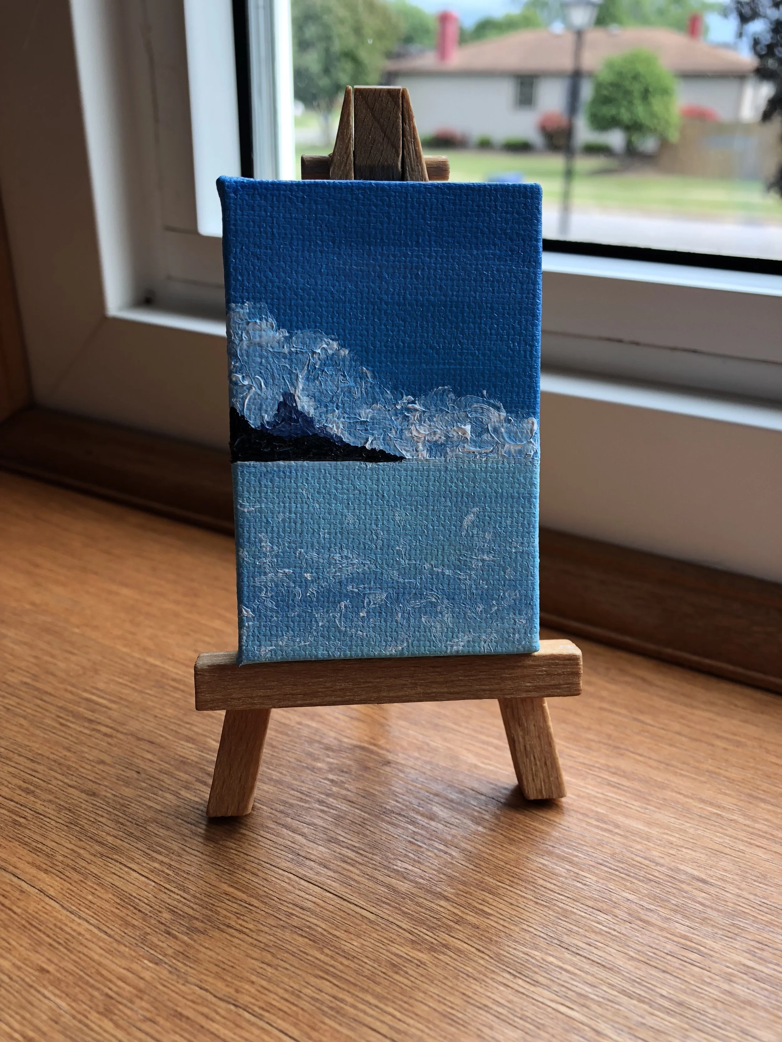
I love to paint but I have always struggled with what to do with huge paintings once I finish them; I was given a solution a few years ago when we did a white elephant gift exchange at school and I ended up with a tiny canvas, a tiny paint brush and a tiny easel (pictured). And from there I have been inspired to create hundreds of tiny canvases, most of them being 3x3 inches, but I made a few that were 2x2 inches. I have since signed up for numerous craft shows in my town and people love to see them because it’s something that not everyone is selling and that not everyone can do, painting so small (sorry for the humble brag). But I have discovered a whole new passion because of a randomized gift exchange, so thank you Will for buying a tiny canvas for the gift exchange.
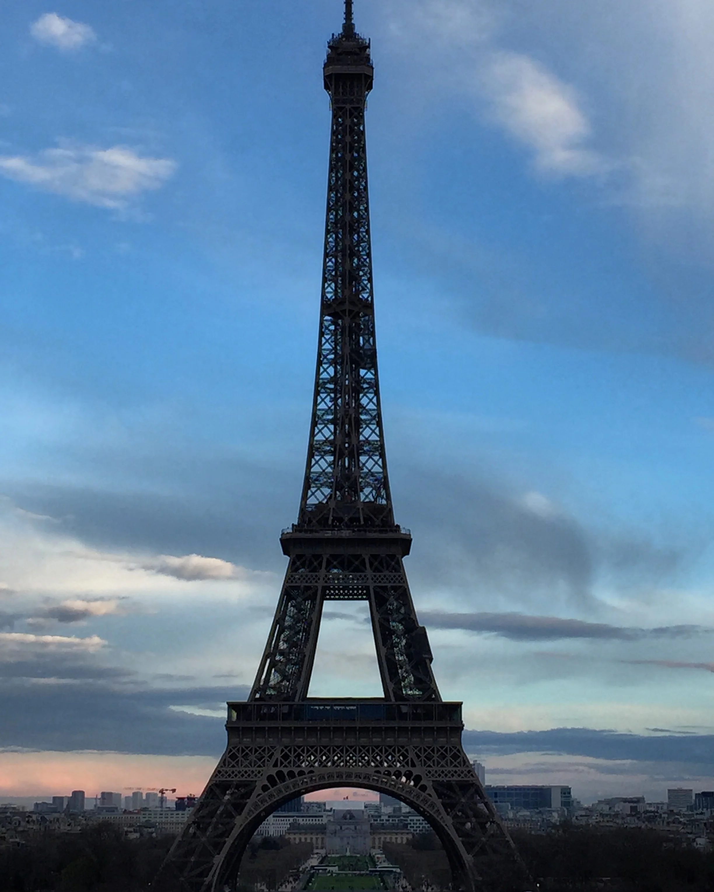
Photos, Photos, and more Photos! On my trip to Europe I took thousands of photos, and it took forever to go through them all once I got home. The cities of Paris and Versailles were so beautiful, I cannot wait to go back! Until then, maybe I’ll just hang these in my house so I can pretend I’m still there.
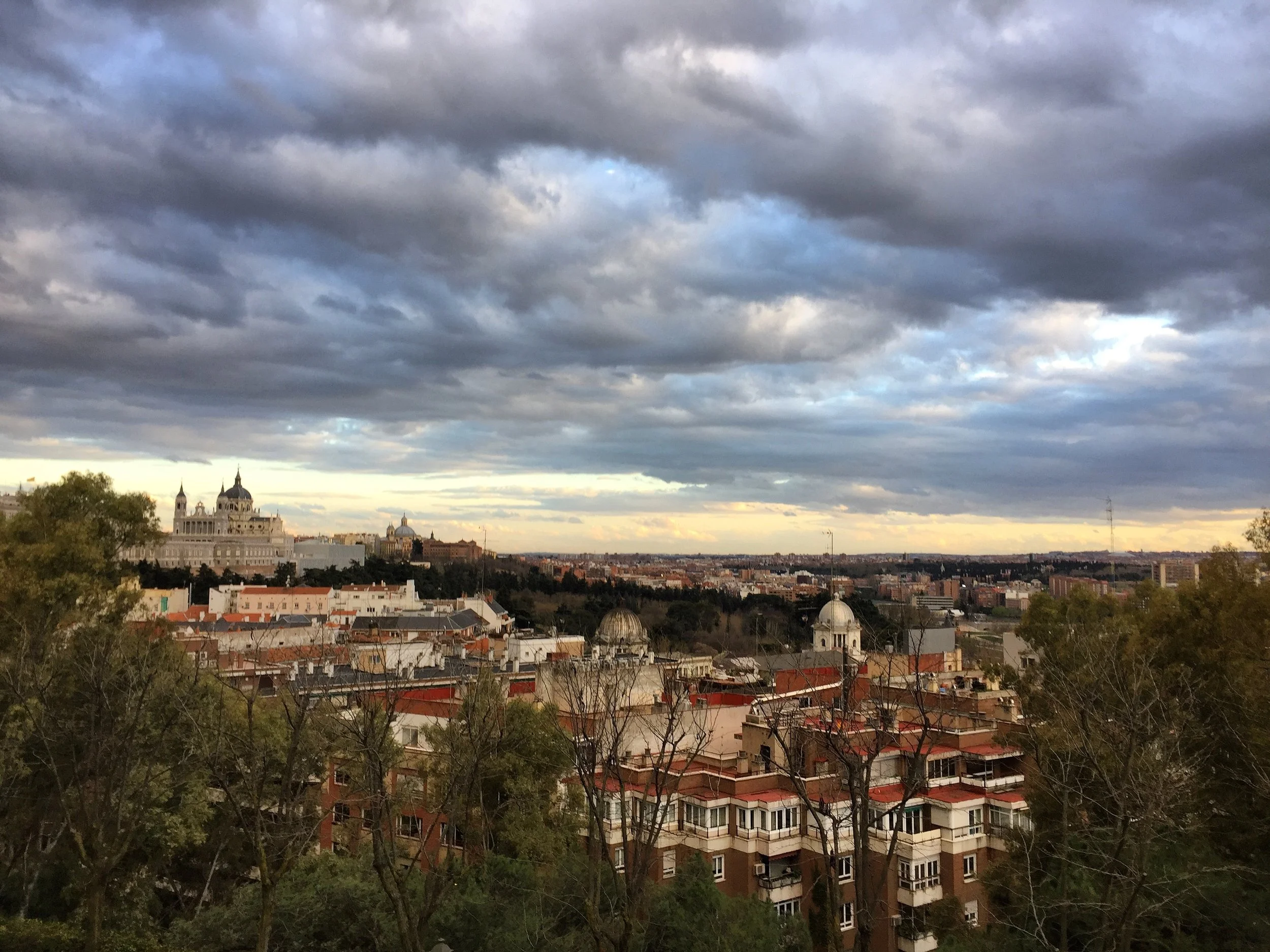
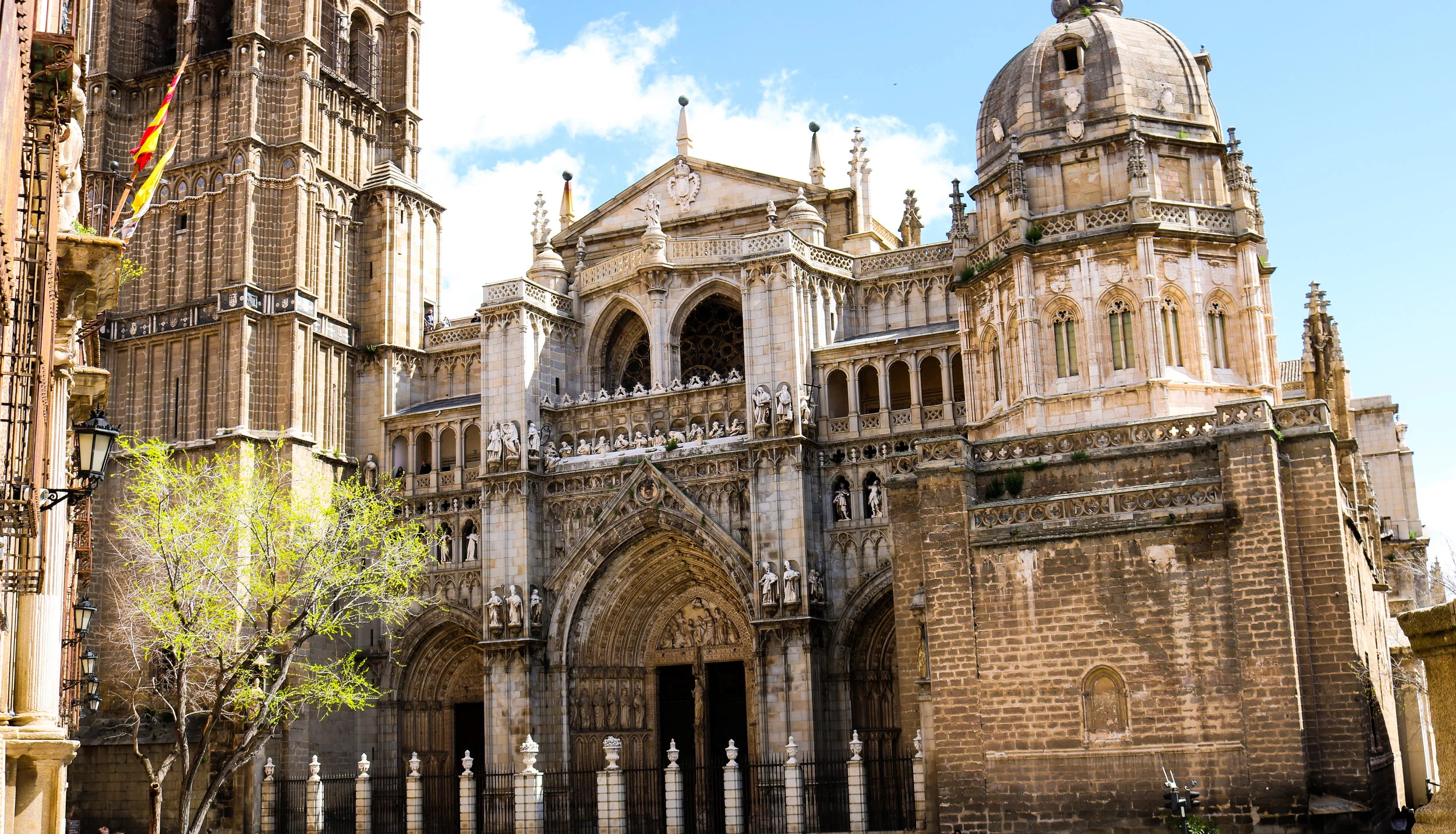
And just when you thought the photos from Europe were done, THERE’S MORE! Madrid and Toledo were so lovely, and warm too! These are part of the small group of photos that weren’t photobombed by one of the students - namely Mikey or Sam. If I could post every picture form the trip, I would. They’re so beautiful I just want everyone to see them and travel there to experience it for themselves - the culture, food, and people are so amazing. I will be back soon *hopefully*.
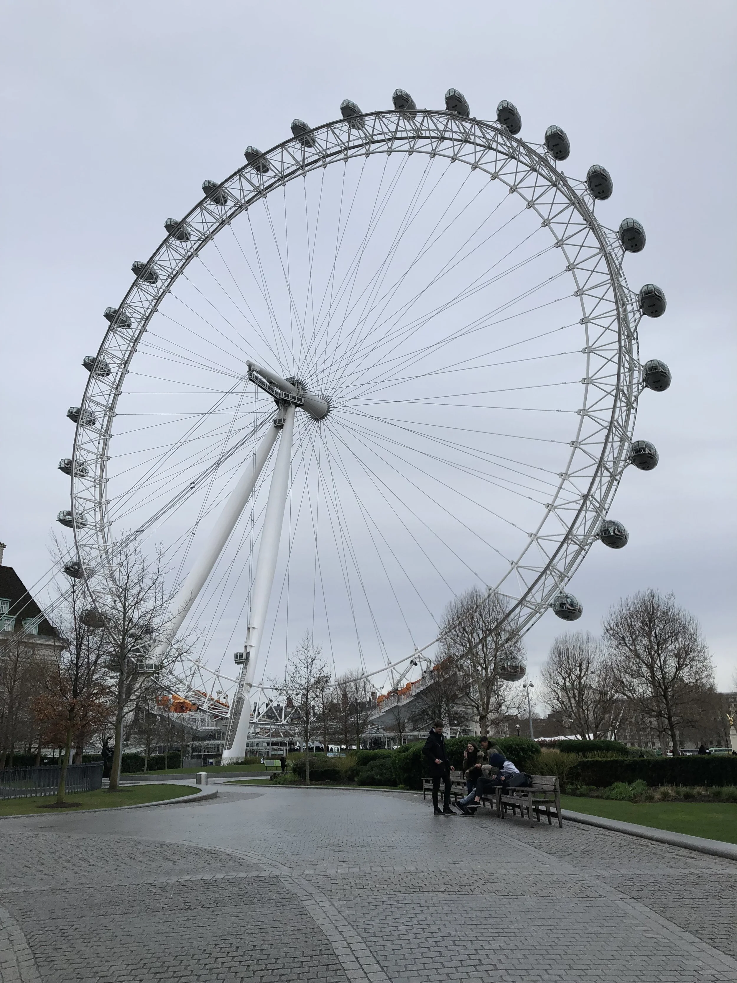
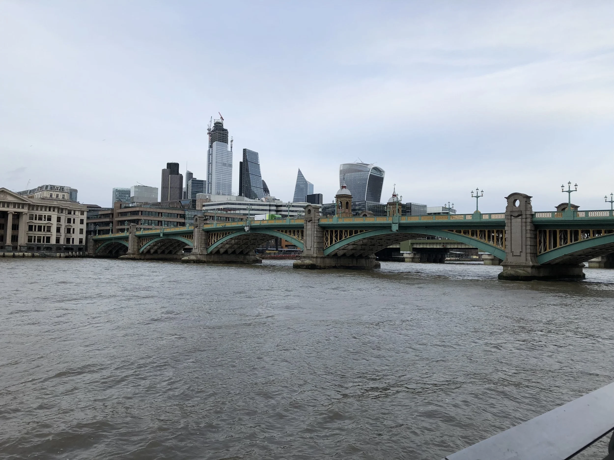
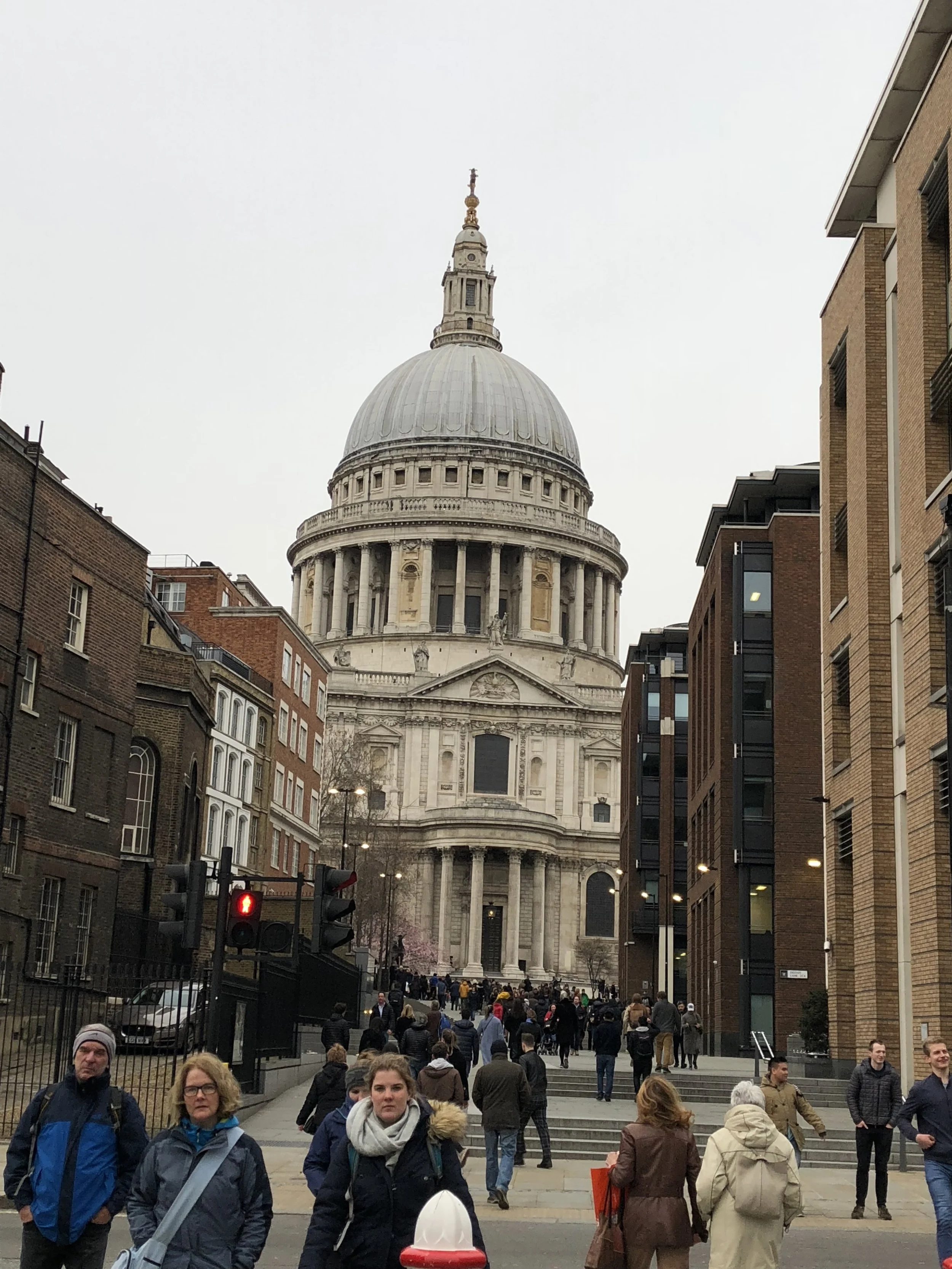
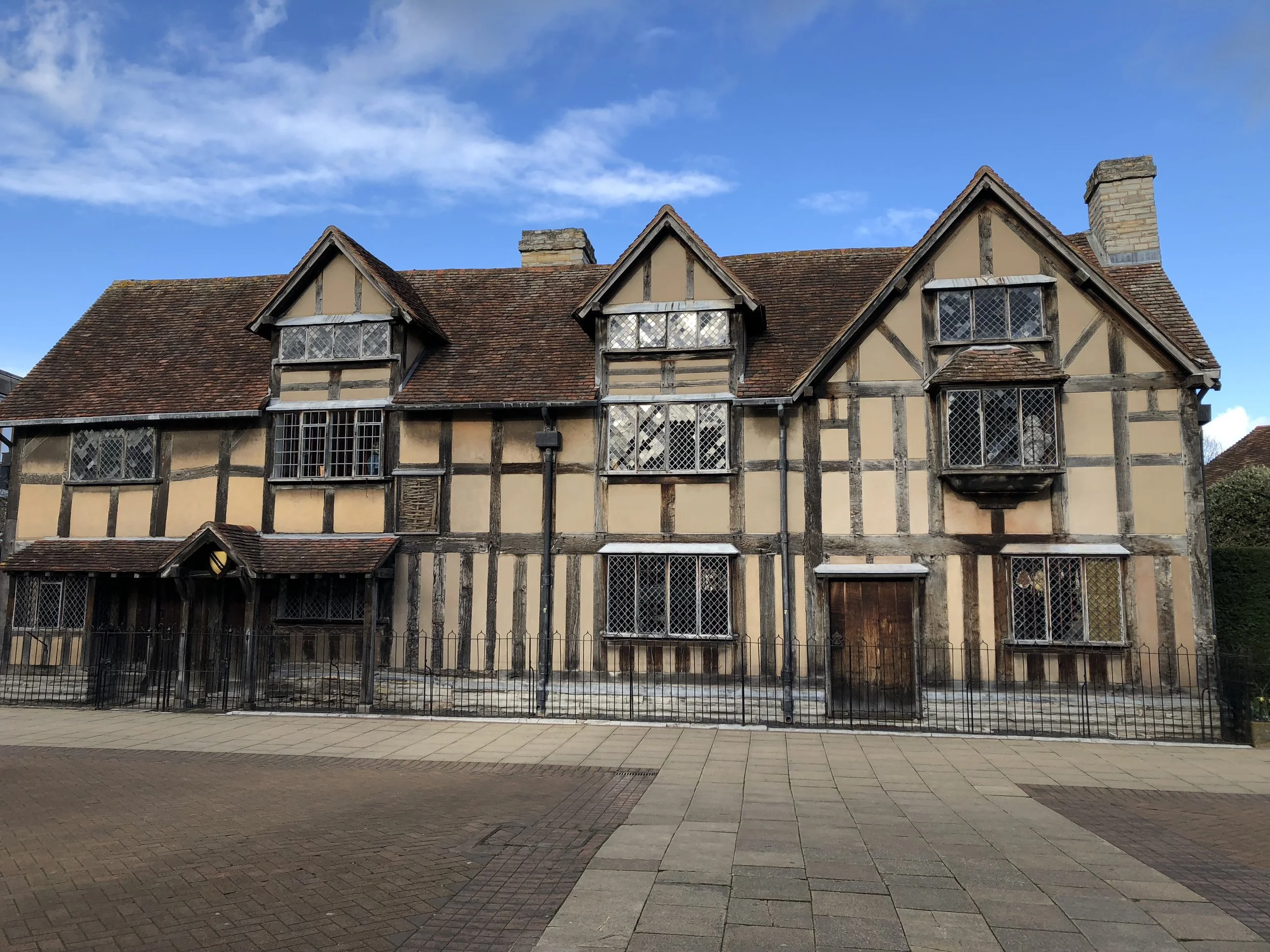
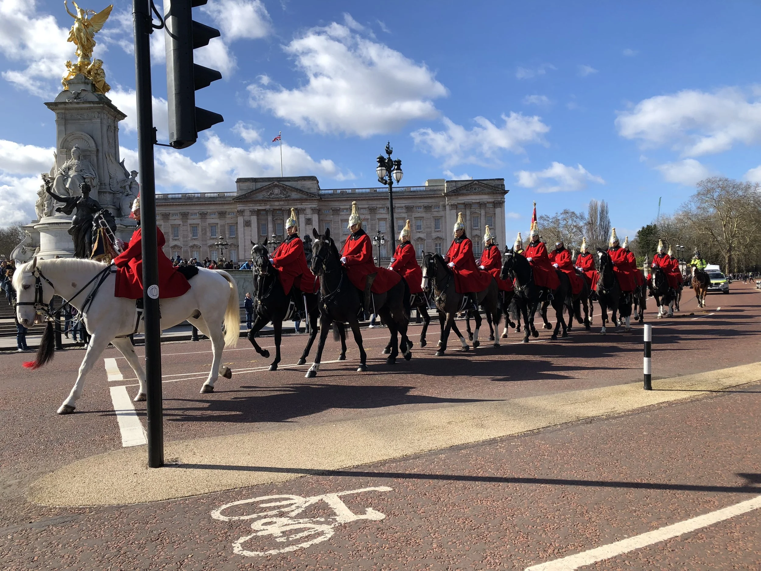
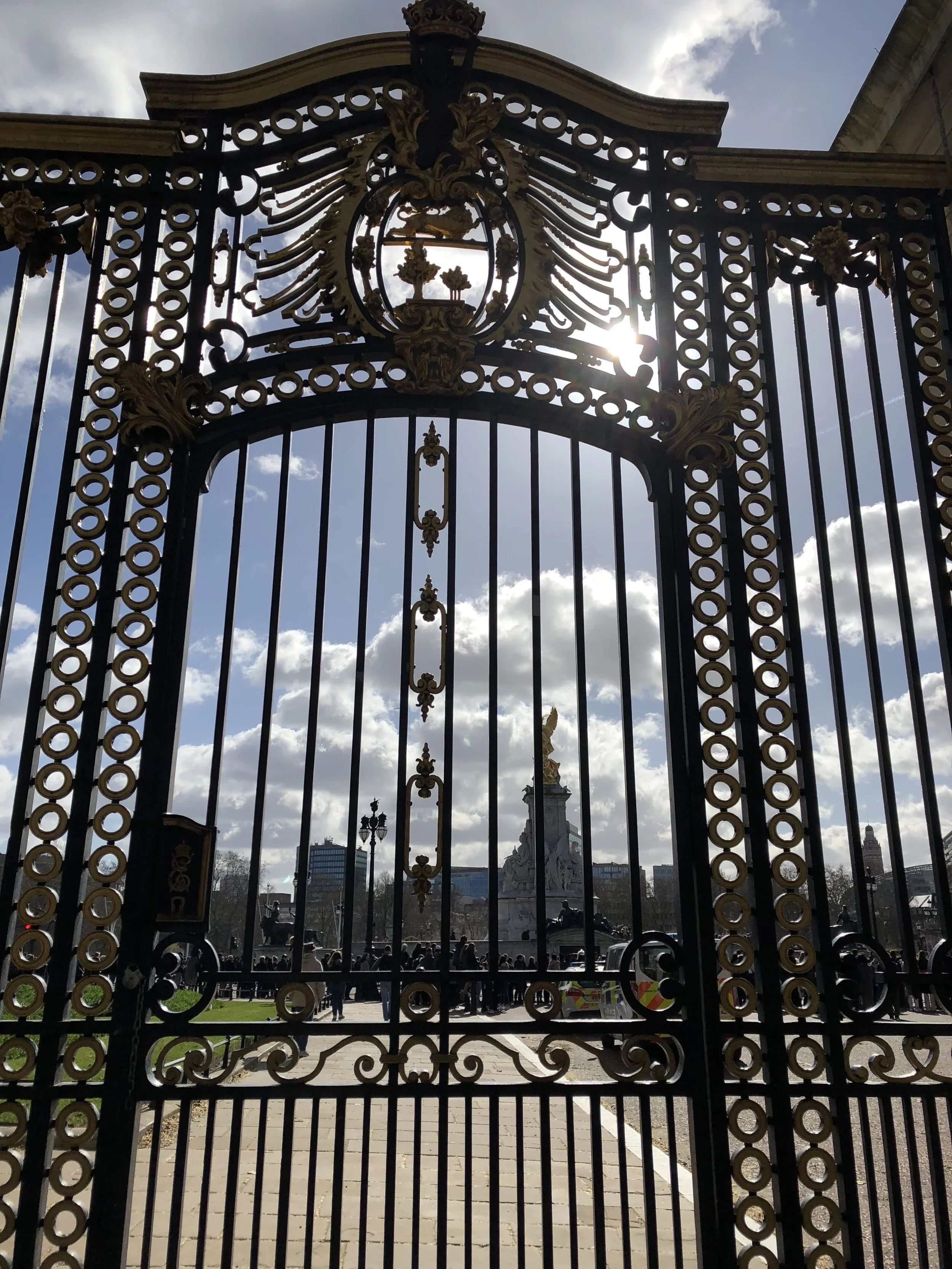
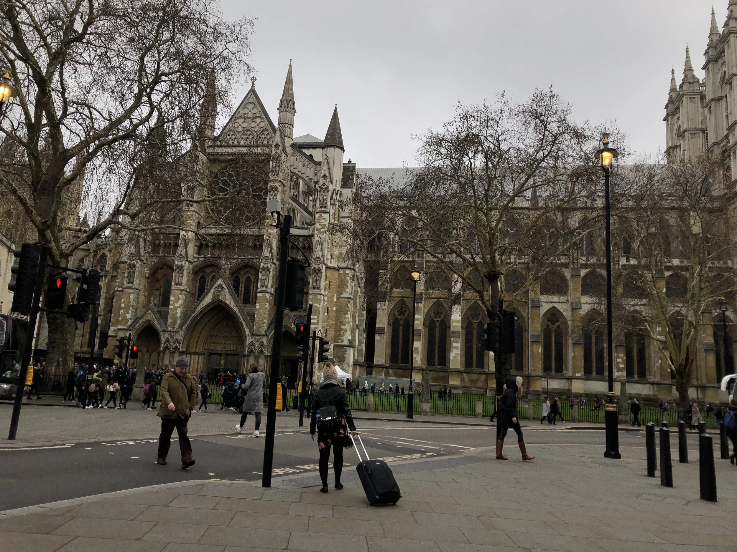
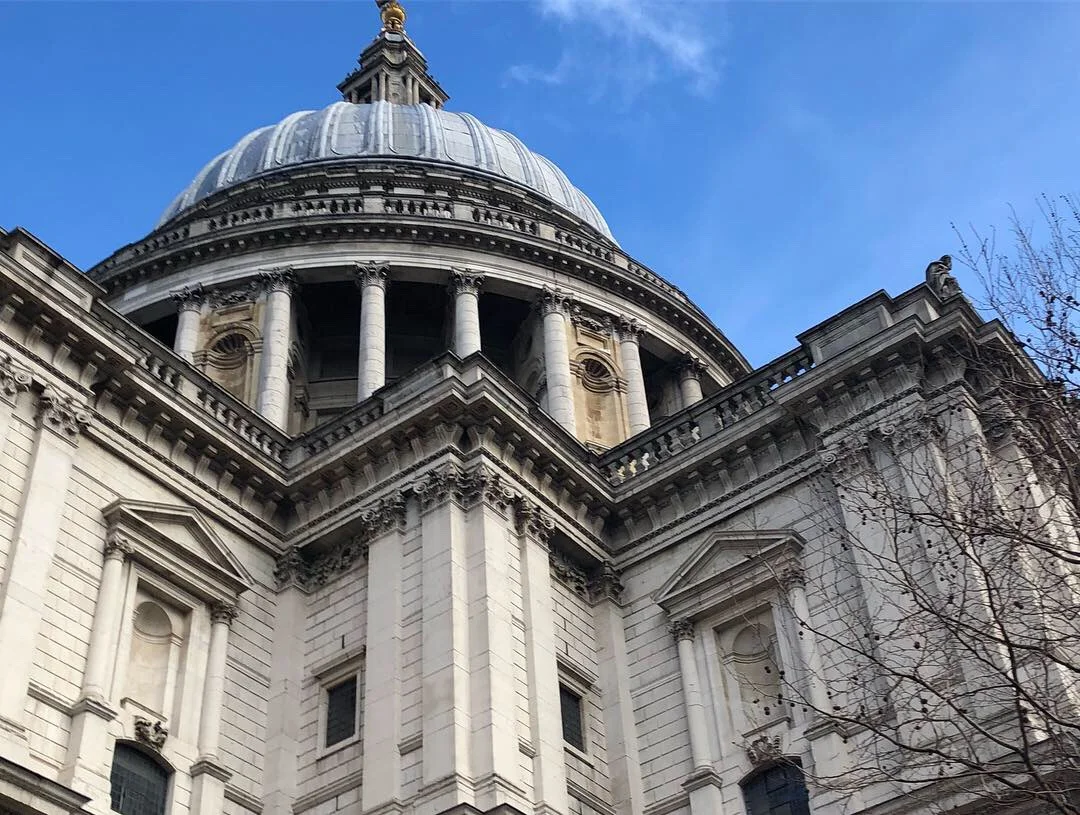
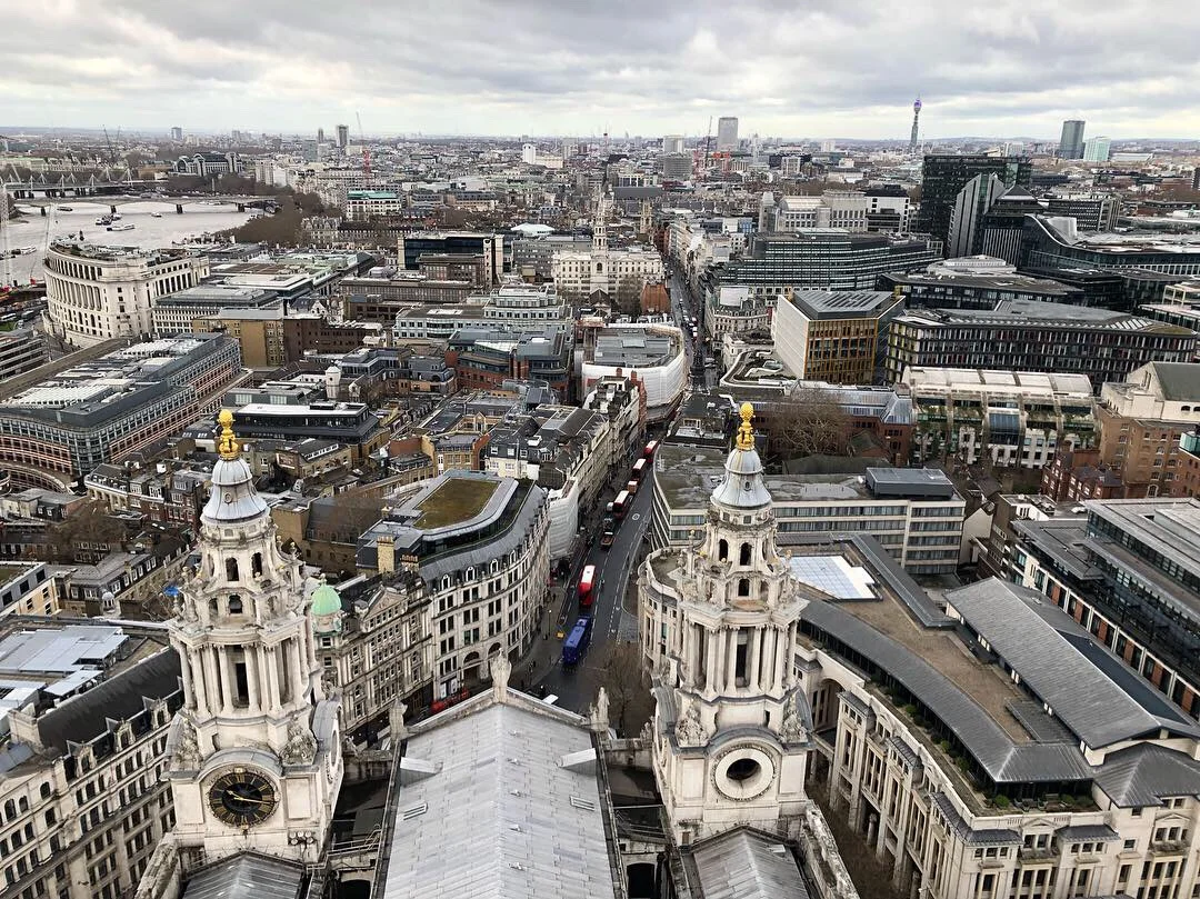
In March 2019 I went to London with my college; I took a British Literature class and we read works that took place in the city, and then we went abroad and saw the places these stories took place. It was one of my favorite cities I’ve ever been to, it was so easy to navigate and the city was so beautiful. I took so many photos it was so hard to choose just a few. We also took a day trip to Stratford, where Shakespeare was born and where he is now buried. Fun Fact - Shakespeare is my birthday twin! We went to the changing of the guards at Buckingham Palace and Prince Harry and Meghan Markle (and by proxy, the newest royal baby) drove right past us! We also saw the Prime Minister, Theresa May, but it was less exciting. I also got to visit St. Paul’s Cathedral, which was amazing because I LOVE cathedrals, and I was able to climb the 582 stairs to the top and the view was breath taking. I honestly cannot wait to go back to this amazing country someday.